Article
Endlich diese Übersicht /// A survey, finally: Yearbook of Type #1

Please scroll down for English version.
Immer wieder eine Herausforderung für Designer:
Wie finde ich die richtige Schrift für meinen Auftrag(-geber)?
Wie finde ich mich in der Fülle neuer Schriften auf dem Markt zurecht?
Das Yearbook of Type #1 bietet als weltweit erstes, unabhängiges Kompendium einen Überblick über die zahlreichen Neuerscheinungen. Das macht Sinn, denn in den letzten 20 Jahren hat sich die Veröffentlichung von Schriften radikal gewandelt. Heute verfügen Designer über die Produktionsmittel/Programme, um eigene Fonts zu gestalten – ganz anders als einst im Holz-, Blei- und Fotosatz. Zudem dient das Internet als allseits zugänglicher Vertriebsweg.
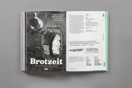
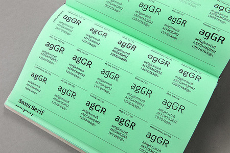
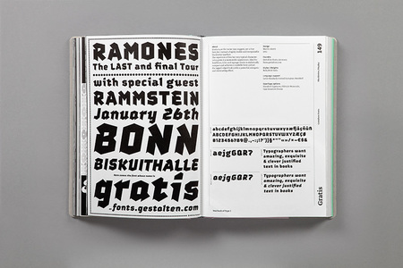
Weblogs und andere Plattformen informieren regelmäßig über neue Fonts und Foundries, doch eine Übersicht in gedruckter Form gab es bislang nicht. Hier setzt das Yearbook of Type an: Die Spannbreite reicht von kleinen, unabhängigen Typografen oder Foundries bis zu größeren Schriftverlagen. Die Schriften bzw. Schriftfamilien werden auf jeweils einer Doppelseite präsentiert; als Hintergrundwissen gibt es Informationen über die Schriftgestalter, Schaubilder, technische Erklärungen und Essays.
Yearbook of Type #1
Herausgeber: Slanted | Verlag: Niggli | Gestaltungskonzept und Umsetzung: MAGMA Brand Design | Juni 2013 | 464 Seiten | 165 × 240 mm | Sprache: Englisch | Gebundene Ausgabe mit Halbleinen | ISBN 978-3-7212-0861-0 | 49,80 Euro
///
An ever-lasting challenge for designers:
How do I find the perfect font for my client?
How can I cope with the vast amount of new fonts on the market?
The idea behind the Yearbook of Type is quite simple: to offer a high quality selection of the numerous new publications in the field of digital typefaces in the form of a clear, comprehensive compendium. This makes sense, as in the past two decades the publication of typefaces has changed radically. Typeface designing programs haves provided designers with the means to design their own types, in great contrast to wood, lead and photo typesetting. What’s more, the internet offers a means of distribution that can be used by everybody alike.
A variety of blogs and web portals provide regular information about new fonts and foundries, but there still is no high-quality print publication (typography still looks best on paper!). Yearbook of Type is intended as a printed series in which the best contemporary developments in the field of typography are presented: ranging from independent typographers and foundries to larger typeface publishers. Each typeface or typeface family is presented on a double-page spread; plus information on individual type designers and an essay section offering background information and descriptions from the world of typography.
Yearbook of Type #1
Editor: Slanted | Publisher: Niggli | Visual concept and realization: MAGMA Brand Design | June 2013 | 464 pages | 165 × 240 mm | Language: English | Specials: Hardcover edition with half linen | ISBN 978-3-7212-0861-0 | 49,80 Euro
Photos: Slanted