Article
From predictable ritual to surprising annual: 5 design principles for financial reporting

A survey by Sweden-based Box IR among more than 100 investment professionals in april this year found that online annual reports ranked among the least useful activities companies can undertake. And a large-scale survey by the US Securities and Exchange Commission in 2008 found that more than half of retail investors surveyed said they rarely, very rarely or never read company annual reports.
One apparent reason investors don’t read annual reports is that they are filled with legal, accounting and technical jargon. Sarbanes Oxley and Form 10-K legislature have made annual reports of USA listed companies more and more complex over the past decades. Consequently, it takes readers too long to find and extract relevant information. It’s an accessibility problem that’s common to printed or digitally distributed PDF reports. Except for the hardened professional who’s willing to dig deeper, the reports are often too burdensome to use.
Using usability and design principles, companies can make annual reports much more accessible for their stakeholders and also more fun to use. Here are 5 guiding principles that we apply when embarking on a reporting journey with our clients.
1. Connect better with more stakeholders
Digital annual reports which are published online are accessible to many more potential readers than just financial investors. Job seekers, journalists, NGO’s, policy makers and employees can easily access online reports and are all very relevant stakeholders for the future wellbeing of your company. So make sure that your annual report also caters to their specific needs. Use multiple stakeholder perspectives to share the highlights of the past year. And make sure that different groups of stakeholders are treated equally while organising your content for easy disclosure.
2. Keep it simple
Simplicity is the ultimate sophistication. Leonardo da Vinci already propagated this adagium in the 15th century. More recently, John Maeda wrote a small gem of a book about it called “The Laws of Simplicity”. The 10th law is called “The One” and simply states: “Simplicity is about subtracting the obvious, and adding the meaningful.”
Simple is not the same as simplistic though. Richard Ketchen, a Vancouver based annual reporting specialist, puts it nicely in a blog post on irwebreport.com: “I’m a big fan of simplicity in annual reports and, for that matter, pizza. Simplicity is an often overlooked yet powerful strategy for keeping content clear and informative. The objective is to communicate simply, not simplistically, by using structure, brevity and language to convey your messages clearly. That, in my opinion, is the recipe for a good annual report.”
3. Use plain language
Digital annual reports that are published online reach a much broader audience than the printed reports of the past. Jargon is not an option anymore – if it ever was for that matter. You need to use plain language to keep your readers engaged and interested in reading further.
Written material is in plain language if your readers can:
– find what they need;
– understand what they find; and
– use what they find to meet their needs.
4. Create dynamic and interactive content
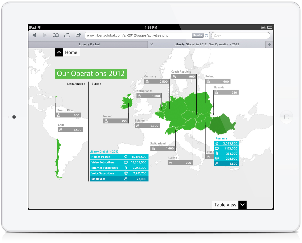
Online channels give us other possibilities to convey a message than printed media. Time, movement, audio and interactivity are added tools to create compelling content. That imposes new challenges on the makers of annual reports. Is the CEO capable of telling a convincing story in front of a camera? How do we film him or her? How can we enrich data from charts and tables with interactive views and layers? And how do users wish to navigate through all the – often mandatory and not always very exiting – content? Structure, layering, progressive disclosure and multiple points of entry help to make the annual report more accessible and also more fun to read and watch.
5. Tablet first
According to a recent survey by Gartner, tablet sales in 2013 were up almost 70% compared to 2012 and desktop and notebook sales show a steady decline of about 7,5% on a yearly basis. By 2015, Gartner expects that there will be more tablets than PC’s shipped, worldwide. So make sure that your readers can read everything comfortably while “on the go” and can watch all dynamic content on all types of tablets. Better yet: optimize your layout, usabilty and design for tablet viewing and apply “graceful degradation” principles for desktop and notebook computers.
“Mobile first” – with a broader scope than just tablet usage – is our guiding principle these days because we see users move towards mobile devices faster than anyone ever predicted. When we design mobile first, the end result is an experience focused on the key tasks users want to accomplish without the extraneous detours and general interface debris that litter many websites. That’s good user experience and also good for business.
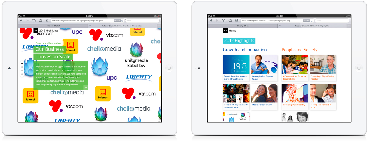
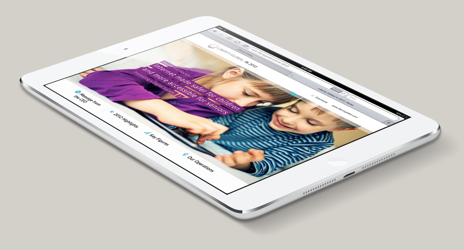
Connect. Discover. Be free: a recent case
Recently we developed the 2012 digital annual report for Liberty Global, parent company of consumer brands like UPC, Virgin Media, Unity Media and Chello Media. We worked closely together with Liberty Global corporate communications on all of the aforementioned recommendations to create the best possible digital annual report within the given timeline, financial and legal constraints that always hamper these kind of productions. Have a look and judge for yourselves whether we’ve succeeded.
Liberty Global annual report 2012
 http://www.libertyglobal.com/ar-2012/
Further reading on annual reporting trends:
Survey on Swedish investor relations
From print to digital: moving the annual report into the 21st century
CSR in annual reports: 7 conflicting trends
Further reading on simplicity and plain language:
John Maeda’s laws of simplicity
Plain language principles and directives
Writing for the web
Further reading on mobile first principles:
Luke Wroblewski’s original post on Mobile First
Mobile First: the book