Article
Italy goes type

In early May, the very first international type conference in Italy took place: “Kerning”. The conference’s Twitter hashtag is #keming. Got it? Kerning means adjusting the spacing between characters, to achieve a visually pleasing result. In a well-kerned font, the spaces between each pair of characters should appear of similar size. This is not always the case – and a big issue in web font technology. The Kerning conference showed that more and more web people speak about typography and that more and more typographers speak about web technology.
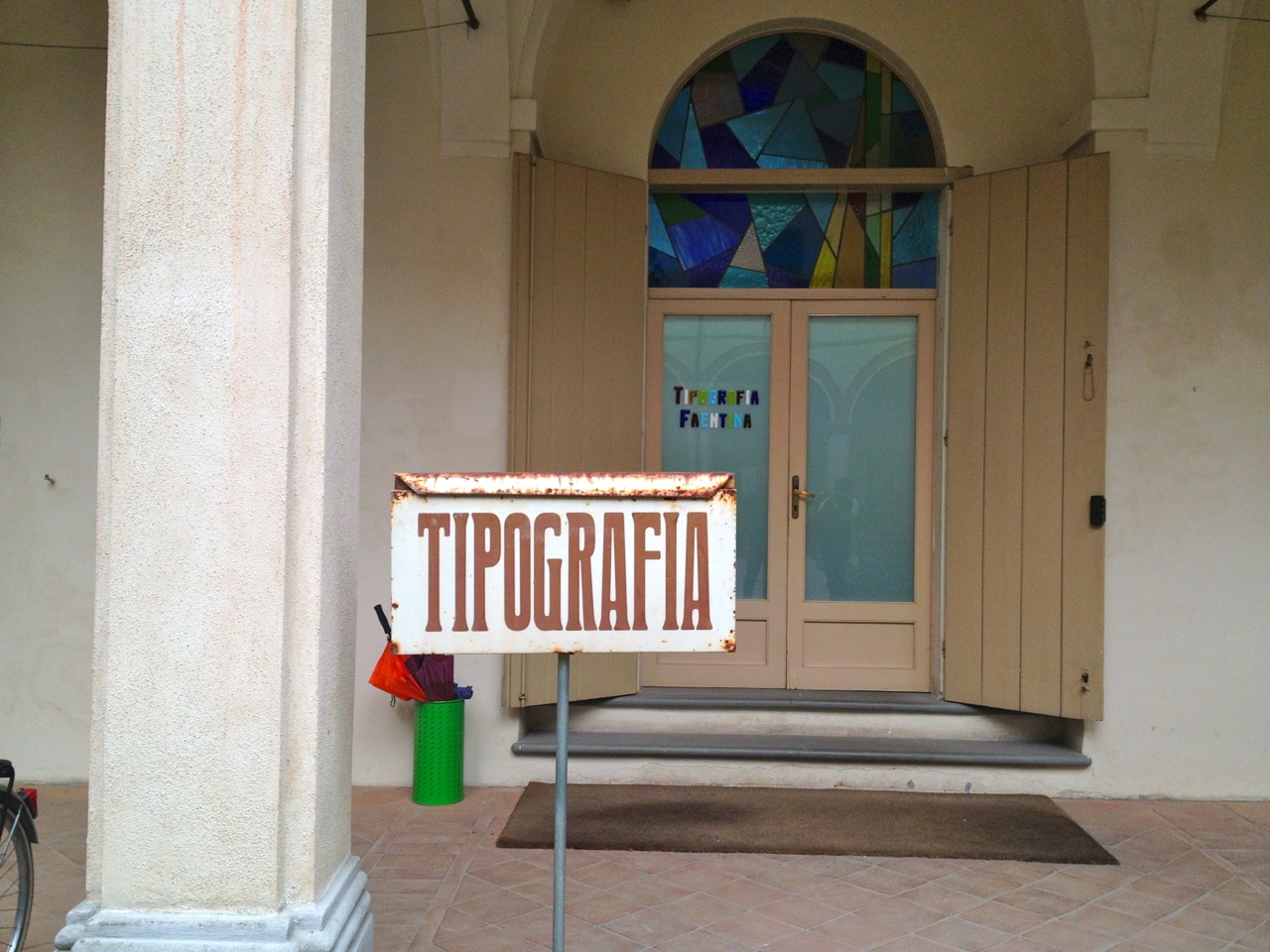
 In the backyard of the conference venue: a handmade “font”, still.
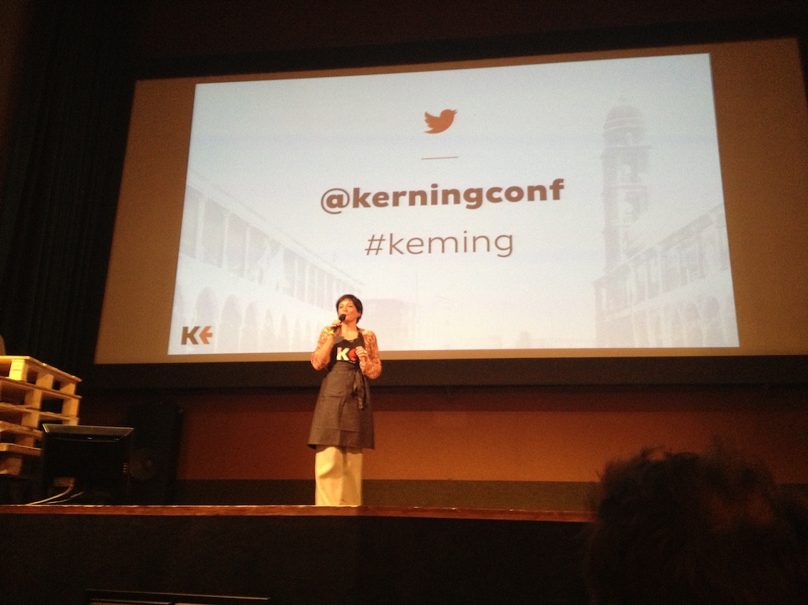 Simone Wolf displaying the conference’s hashtag – and apron.
Then and now
The usage of different monitors, browsers and mobile devices of all sorts is tremendously increasing. Consequently, type designers, type foundries and type conferences focus more and more on technology: It’s no longer done with the “pure” design of pleasant letters.
A small and devoted audience came to the beautiful city of Faenza, near Bologna (famous for its ceramics culture). Keynote speaker Luc(as) de Groot gave “a brief introduction” to the history of font technology, including the basics of kerning and hinting — “Then and Now” (530 slides in 50 minutes). Just one figure: Adobe fonts in the 80’s contained a standard of 115 kerning pairs, de Groot’s Calibri Light in Windows 8 contains around half a million kerning pairs. He himself is the best example for a type designer gone web fonts specialist, redesigning and hinting his fonts for customers and their devices over and over again, if necessary.
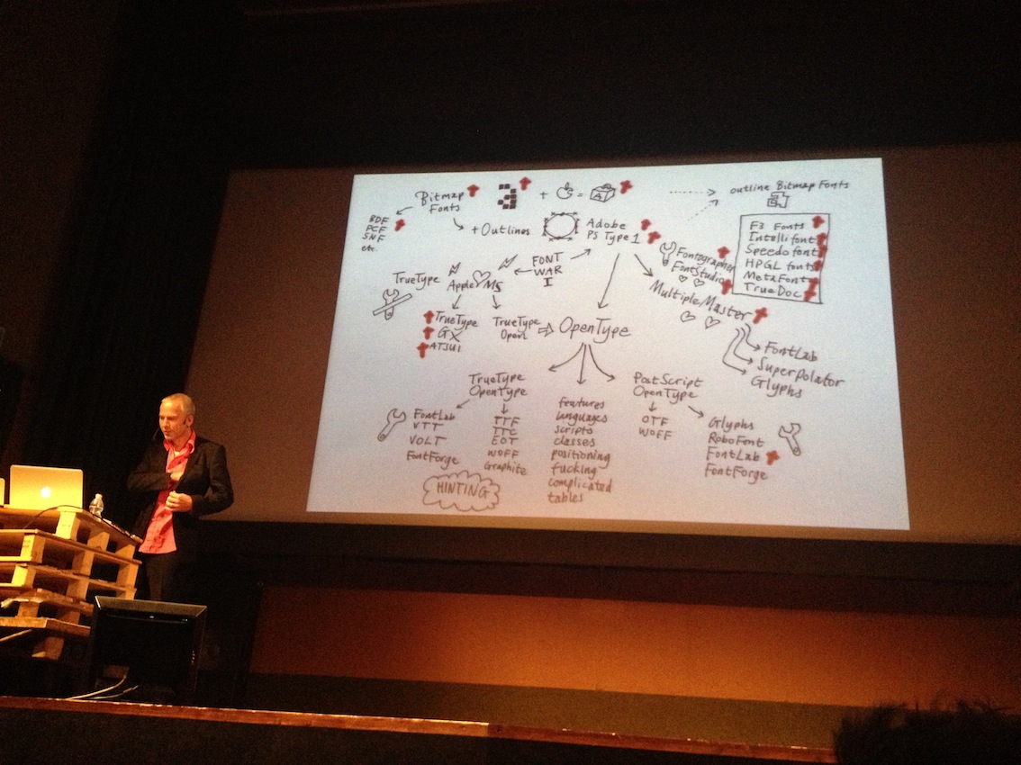 Luc(as) de Groot (@FontFabrik) on the history of font technology.
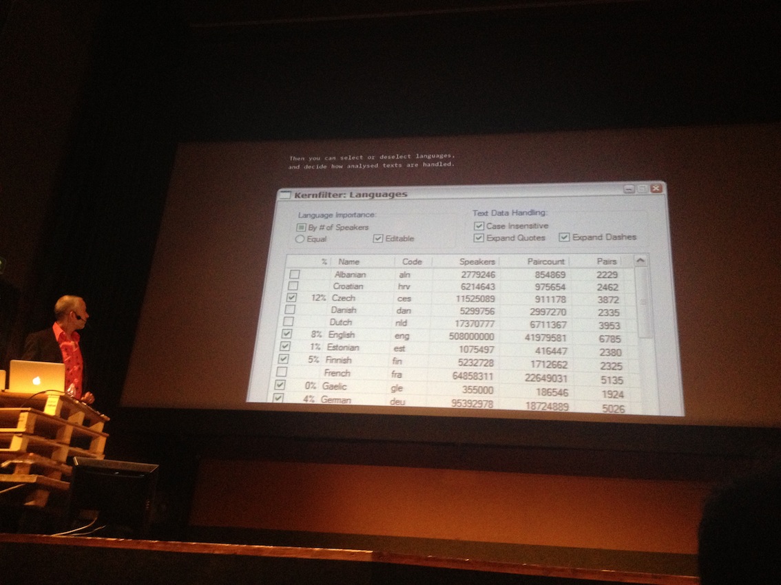 Part of his research: amounts of speakers of different languages.
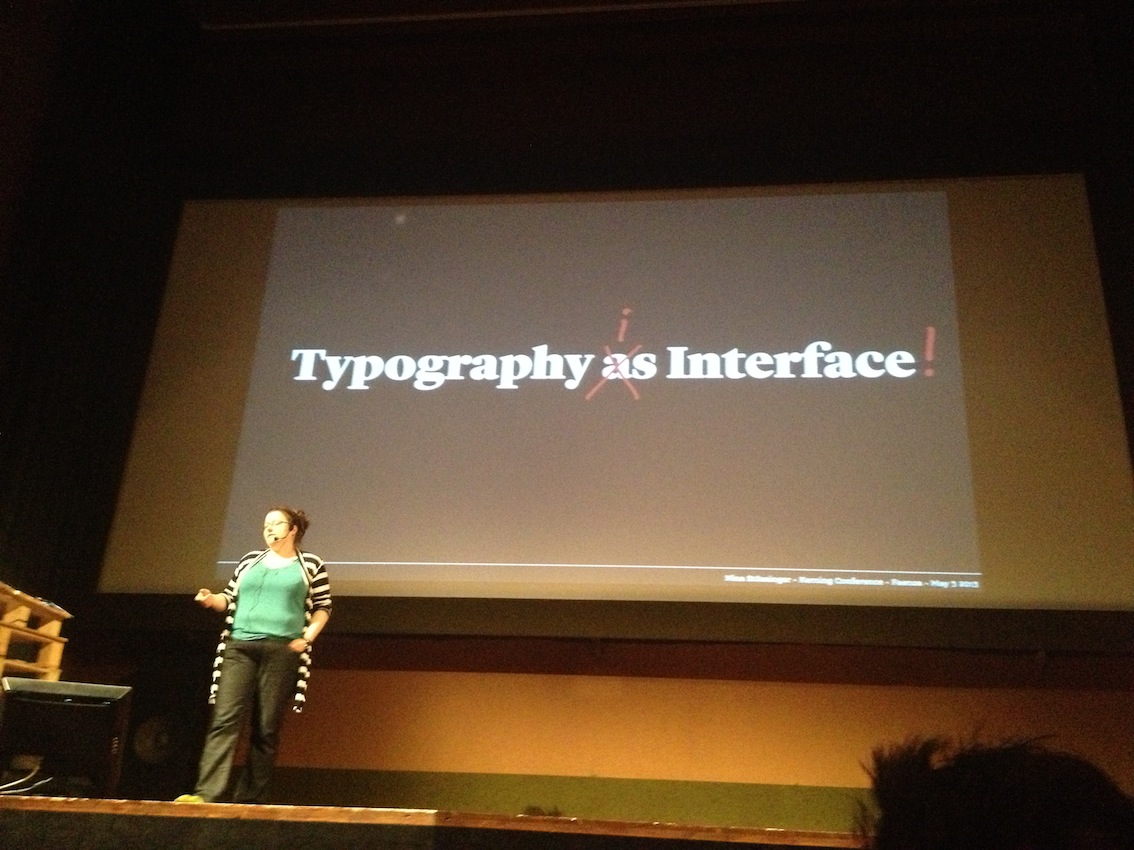 Nina Stössinger (@ninastoessinger) on the relation of type and content.
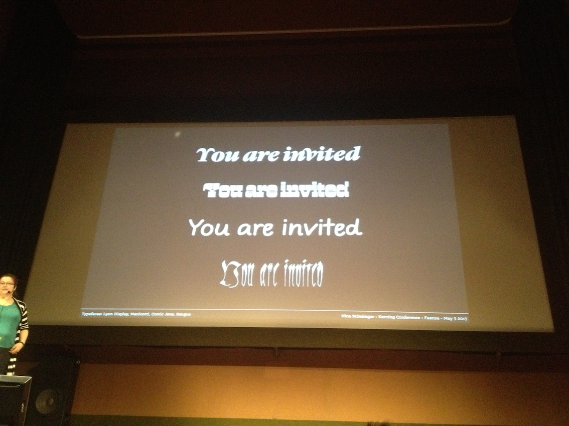 “Type contributes to the meaning.”
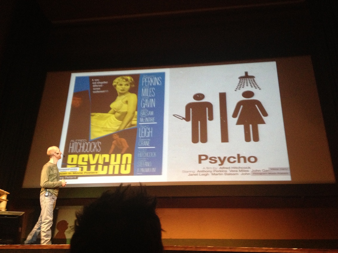 Designer Yves Peters (@baldcondensed), The FontFeed, about another typographical interface.
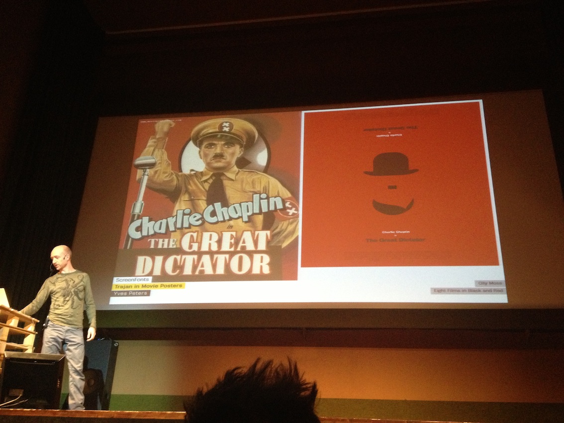 Great examples of typographical redesign of filmposters.
Type and content
Interestingly enough, parallel to all the microtechnological details, the question of content and its connection to type is becoming stronger. Swiss type designer Nina Stössinger pointed out that “letters are not illustrations” and that “reading is not looking”, which comes as no surprise. But it’s essential – e.g. in corporate and service design, to keep in mind “typography can show the skeleton of a text, the structure”, and that “ease of reading has a direct result on being motivated to deal with the content.”
 Richard Rutter (@clagnut), co-founder of Fontdeck and named in the Wired UK list of top 100 digital power brokers, on inspiring web fonts – and the most important precondition for that.
 Bas Jacobs (@underware) on the way fonts are shifting into a more and more digital environment. And how digital environments keep shifting too. (And than he shifted the audience, doing live kerning with us.)
 Marko Dugonjić (@markodugonjic), web standards developer, on, yes, “Responsive Web Technology”.
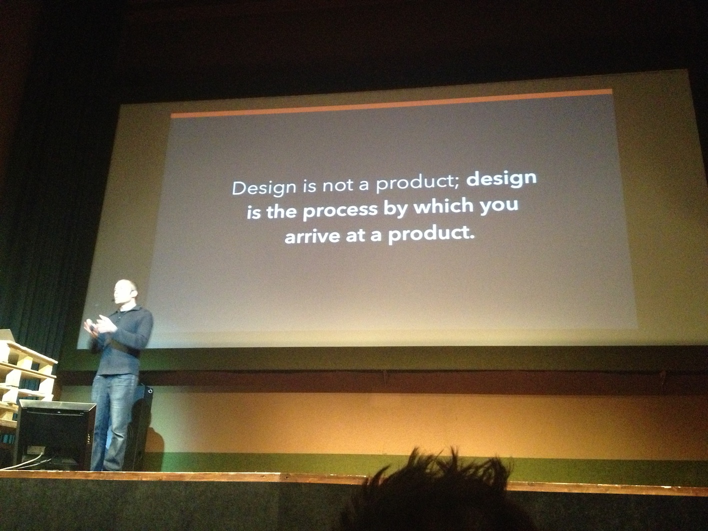 Aral Balkan (@aral) on “Contenct-out Design”, skipping the “user” in experience design. Thanks for that!
In short: With the fonts they choose, designers make a piece of text accessible – a flyer, a service, a magazine or a website’s content. Or they don’t. It’s as simple as that.
“Content and structure should be connected”, says Stössinger, and good fonts are a requirement for that: “I love kerning!” Here is her connection to the fact that “typography is a fiddly craft. It’s a very beautiful fiddly craft, but still, it is a fiddly craft... It needs watchers.”
Watch out for more and stay in touch: Kerning newsletter. Follow @kerningconf on Twitter.