Article
Number salads served with icon dressing…

Numbers, numbers, numbers … are the essence of statistics. They give us important information about the status quo we live in, about past and future developments, they let us make comparisons – and hopefully let us come to the right conclusions.
But numbers for themselves have little meaning: 30% – singles, married, obese, retired, under voting age, vegetarians …? Or: 10,500 – new workplaces, cases of cancer, births, burglaries, kilograms of drugs confiscated?
How numbers become information
In our times of quick-reading, numbers need visual assistants to help them enter – and stay – in our brains. Pictogram-style images can do exactly that. They put numbers in context, and immerse them with meaning: suddenly numbers become a measure of success, of failure, they are reassuring or alarming, give warnings, fulfill our expectations or surprise us.
Quite logically, when designing the corporate image of “CBS” (Statistics Netherlands) Edenspiekermann let numbers in conjunction with pictograms become the key visual elements. Marieke Griffioen explains why in an interview with the Marketing Tribune: “Figures come to life. The collection and sharing of data is the core activity of the CBS. This property comes to life literally in the house style. It is the central theme of the style.”
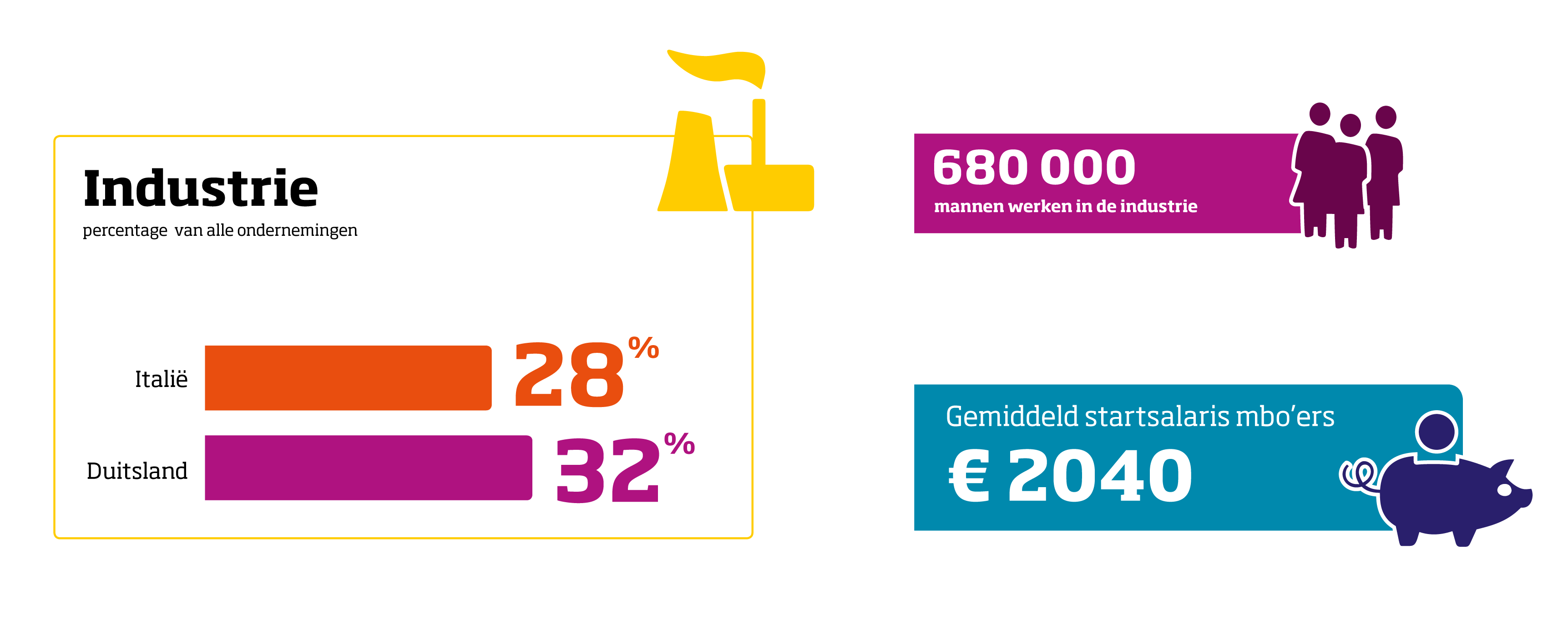
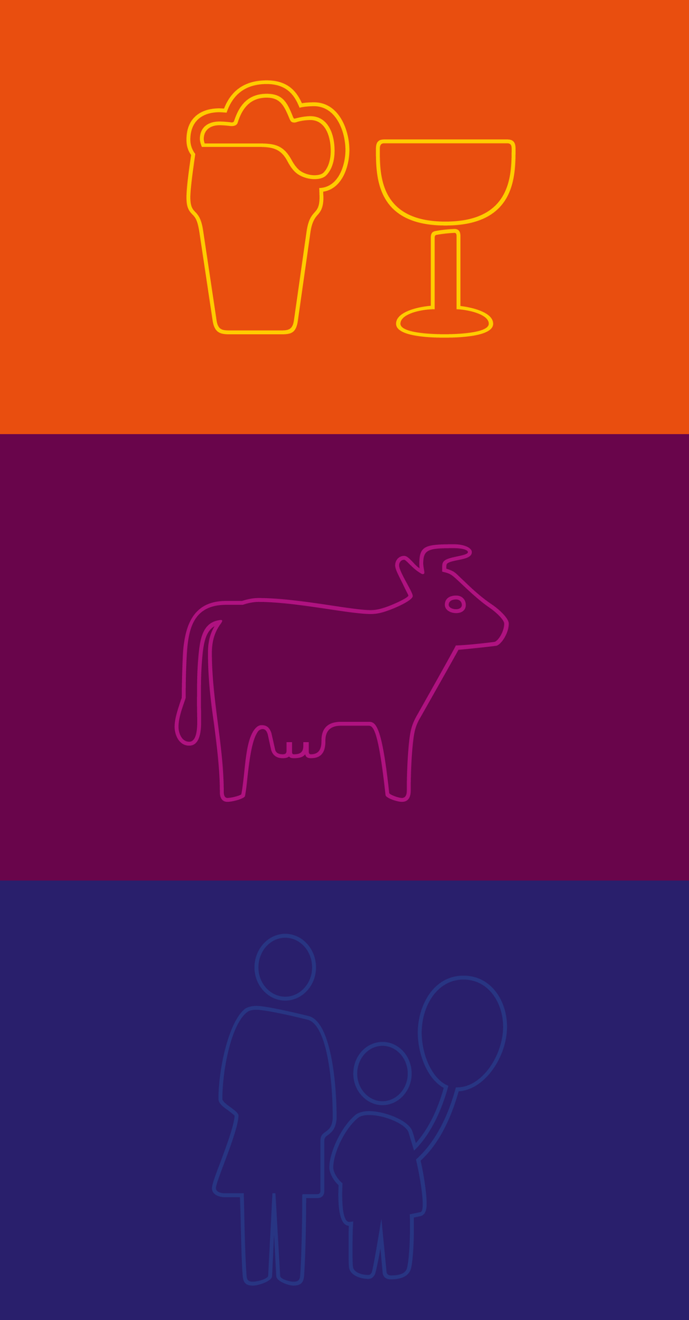
On the pages of the new CBS publications and on the web, numbers and pictograms in bright colors are the eye catchers. They address themes ranging from population, agriculture, education to criminality. Stylistically the pictograms are related to the headline typeface Soho, a robust rectangular, at the same time slightly softened slab serif. Formal elements like the softened rectangularity and weightiness find their equivalent in the pictogram style.
How to make numbers work
The little images, well-nourished as they are, intentionally transmit an attitude of relaxation, sympathy and humor amid the serious world of statistics. Small details stress the commitment to correctness of facts presented in a lighthearted way.
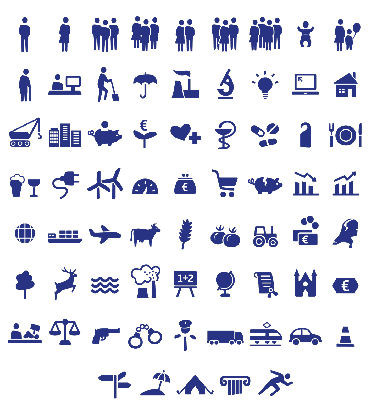
Looking closer, we notice that each pictogram is actually three pictograms – two filled ones and one outline version. They can be used separately or layered on top of each other with different colors applied. In fact, the CBS pictograms are actually a font family containing 12 different layered fonts corresponding to the 12 different main topics CBS has to cover.
Technically this has many advantages. Just as with text, the pictogram size can be quantitatively adjusted by changing the point size. They can be set like lines of text with easy adjustment of tracking and line spacing. And just as easily they can be set in tabular form since their widths are monospaced.
Another advantage, of course, is that a font family is a very practical way of storing and accessing 60 x 3 images. As a comparison, imagine all the text characters we access from the keyboard were stored in a folder, each as a separate eps file. Finally, when updates with new pictograms become necessary the new images can be placed on still vacant character positions of the keyboard (after all, there are almost 200 positions).
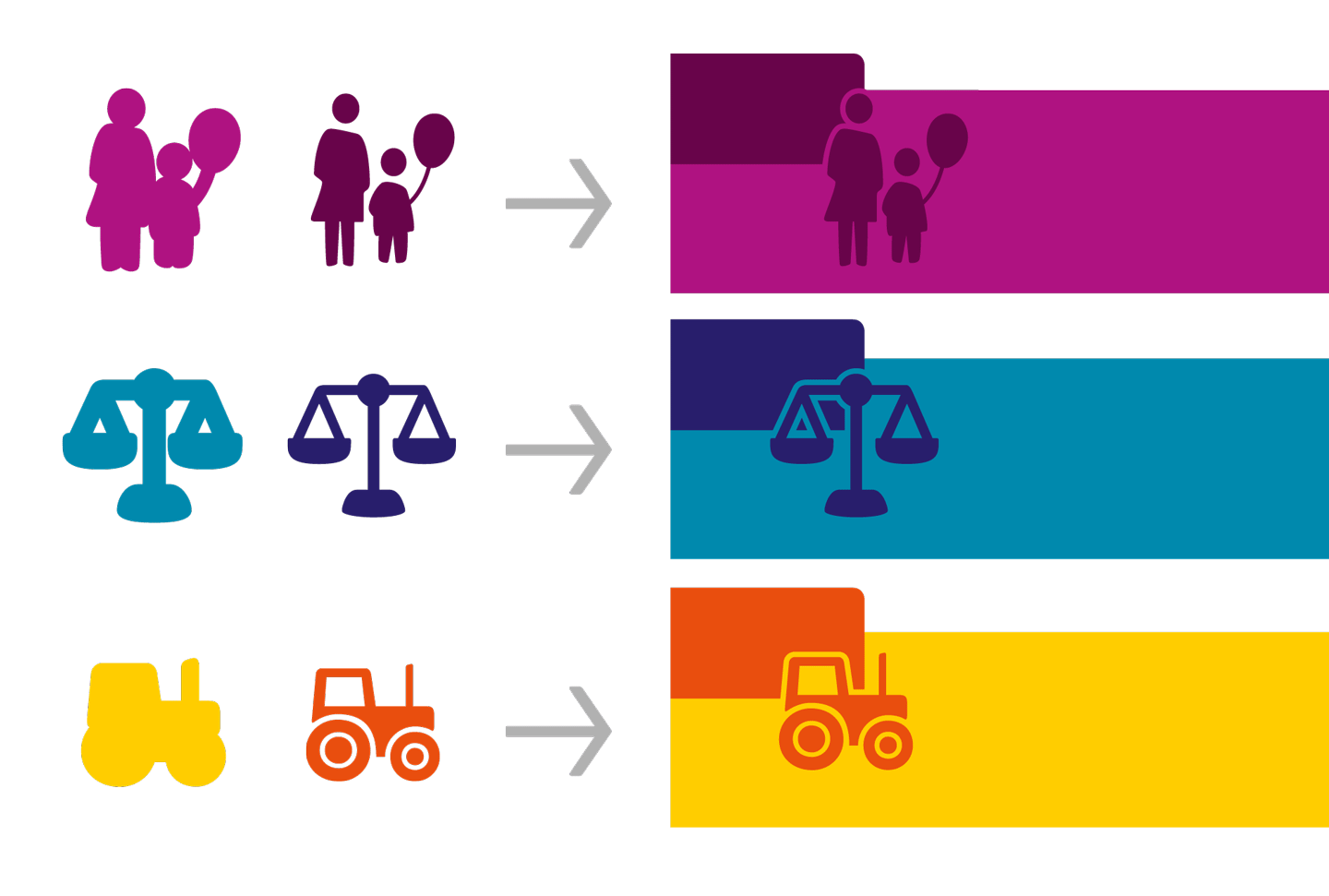
But what is the idea behind layered fonts? In our case it works like this: each pictogram has a background and a foreground image. When we set them hitting a key on the keyboard they appear adjacent to each other. Now we can easily apply different colors, activate OpenType features and the two forms slide precisely on top of each other. The principle is nicely demonstrated below in an illustration by FontFont explaining the layering of the FF Mister K Dingbats font.
For the CBS identity we furthermore made outline versions of each icon. Potentially they function as extra layers on the filled icon versions but at this stage they are used exclusively in large size as illustrations on brochure covers and chapter openings.
How numbers become part of the branding
The CBS identity reflects a new aspect in corporate design – the central role given to a typography relying not only on a text and a display typeface family but also on stylistically complementing typographical imagery. As OpenType features are (finally) becoming common knowledge among designers, and internet browsers are supporting them, custom font families can be integrated containing not only character sets of different language systems but also dingbats, pictograms, symbols, patterns, etc – all taylored for a distinct corporate style.
Pictures: Edenspiekermann and the respective clients