Article
OOCSS and the pagification of modules

Ever since Nicole Sullivan coined the term “Object Oriented CSS”, a shy more before a year from today, most of our usual problems with CSS maintenance have gone away. However, as creatures of bad habits, we developers are always “eager” to adapt new ones. One, specifically, that I have noticed happening lately during my workflow is the following.
The problem of mapping CSS objects to content entities
There are many aspects of a project that dictate a specific separation of code into what we call “modules”, “widgets”, “objects” or “partials”, among other names. The differentiators may be visual separation, content variation, backend model architecture, JS views, but whatever they are, they don’t always agree with what a CSS developer “reads” in a design.
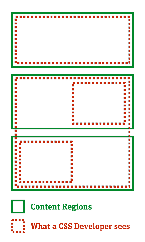
The laziest route to tackling such cases would be to create our CSS Objects in accordance with the green lines above. These objects would be more granular than creating whole pages and we would still protect their scope by using a naming methodology like BEM, so this is scalable and modular architecture, right?
Wrong.
The main principle of creating an object is reusability and since these parts are not defined with this goal in mind, rather than imposed by one of the aforementioned restrictions, we would deprive our objects of this flexibility. We would be creating pages, again, only of smaller size, which would appear once or twice in a project. That’s not helpful, of course, and it replicates the problem of overly specific styles, only in a different scale.
A theoretical discussion
The problem here is that we confuse true CSS objects with faux objects, whose outlines are defined by other criteria than those of scalability, reusability and modularity. And it’s not hard to fall into that trap; one of the hardest concepts of abstracting repeatable visual patterns from a design, is to keep them free of any semantic anchors that may drag them down into Specific-Land.
Quick quiz: In a site we have a media object (image-title-text) that is applied on lists with news items, products, authors. In one page, a specific occurrence of a list of news items requires a completely different visual style, such as two images and no text at all. Do you create a new modifier in the media object to handle those styles or do you create a new object? If so, is its name closer to the “media” object or to the “news” item? Send your answers to s.martzoukos@de.edenspiekermann.com, or write a blog post and send me the link. No, really :), send them and I’ll prepare a blog post to keep the conversation running. There is a lot to discuss on this topic.
Going back to these faux objects, the ones that contain smaller true CSS objects, they include styling information regarding the relationship of their children – relative size, ordering, spacing between them – things that are important and can’t be crammed inside the existing CSS objects. On the other hand, defining them as such themselves is wrong as they do not qualify as repeatable patterns.
A practical solution
So, what do we do with these entities?
It turns out that the answer has been out for almost two years and it’s been provided by Jonathan Snook in his book SMACSS (Scalable and Modular Architecture for CSS).
Specifically, in the layout chapter he describes how to create and name classes that contain style information relative to the layout of their contained elements. These use the “l-” prefix (which stands for, as you guessed it, “layout-”) to separate themselves from true objects and lie in a different folder.
This convention would help us as:
— We would, without guilt and worries, have a new place for all these objects that currently don’t exactly fit into our modular architecture.
— Awkwardly unproportional page-scoped objects (like “_homepage.sass”) would now have a separate folder to lie within, instead of sitting next to smaller ones like “_button.sass”.
— With the l- prefix naming, layout objects will be easily distinguishable in your HTML code.
That would be one way of going about this, of course. Other solutions, like Brad Frost’s Pattern Library, suggest the notion of templates which amount to pages. This is a perfectly valid way of building things, as long as you have started doing it with the whole atomic design concept in mind, instead of including it mid-project.
Footnote
CSS architecture is a fairly new principle of front end development, although CSS has been around for almost two decades – the fact that the main culprit for any front end code refactoring has been CSS makes this contrast even more striking. If you feel that there is a lot to explore, challenge and change in this area then don’t hesitate to drop us a line. We are hiring and we are bound to change the world, one CSS object at the time.