Article
rbmaradio.com — Under the hood

Edenspiekermann recently relaunched the Red Bull Music Academy Radio. In this post Lukas Hodel and I give you a brief overview about the technical background of www.rbmaradio.com. We tried to write this post in a non-web-developer-should-also-understand-at-least-a-tiny-bit kind of way. In the future we will also post some more detailed what-the-hell-are-they-talking-about posts.
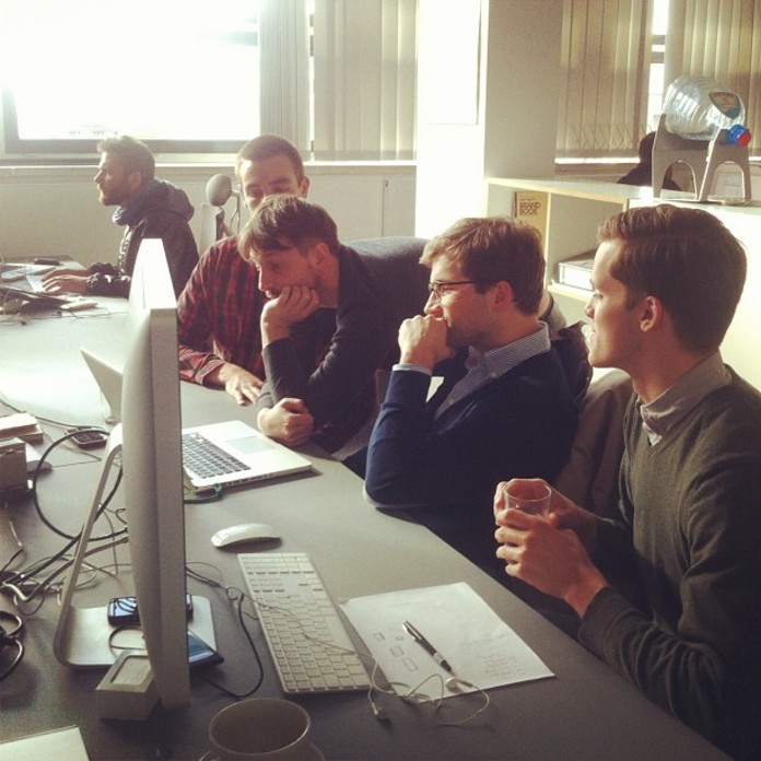
 Photo by Marlene Schufferth
[readmore]Continue reading![/readmore]
Single Page App
We wanted the player to keep playing while the user explored the site, therefore it was clear that www.rbmaradio.com had to be a so called Single Page App. Single Page Apps are the latest evolution of websites which behave much more like desktop applications.
To accomplish this, two technologies were crucial:
1. Client side HTML rendering
2. Client side routing.
Client side means directly in the user’s browser.
Client Side HTML Rendering
Most of today’s websites are rendered on the server side. This means that every time the user interacts with the website, there is a request to the server, then the server responds with a rendered HTML page. With client side rendering, many of these requests are obsolete, making the site dramatically quicker.
Client Side Routing
Since we were rendering different HTML layouts, directly in the user's browser, we had to make sure there was a possibility to navigate directly to a certain page. For example, a layout could be a whole page or just part of a page. When you browse the site, you will notice the URL changes corresponding to the current page. This makes it possible for search engines to index the website and gives you the ability to share or bookmark the page.
It’s all about JavaScript …
For a long time JavaScript had a reputation of being a dirty language. One would only use it to pimp out websites with fancy effects.
In modern Single Page Apps, JavaScript is not just used for adding fancy bells and whistles, it makes up the core functionality of the website. Over 50% of Red Bull Music Academy Radio relies on pure JavaScript code. As you might imagine good structured code is crucial in maintaining such an application.
We decided to structure the code in modules. Every module has clearly defined responsibilities. The modules communicate via a global event bus, that means they don't interact directly with each other. Doing so, we can guarantee that the app still works, even if a module is not ready yet. (“What the hell is a global event bus?” would probably be a good title for a future blog post.)
With this in mind, we chose the following combination of tools and frameworks:
... and Ruby
On the server side, we decided to use the web application framework Ruby On Rails. It’s a framework programmed in the Ruby language which got very popular in the last 6 years. We chose Ruby On Rails because of its huge community and also, in our opinion, programming in Ruby is just more fun.
Listen to the sound of music …
The most important part of a web radio is of course the music player. For this task we chose the excellent open source project SoundManager2. What’s awesome about SoundManager2 is that it automatically switches between Flash and HTML5, making it work on many platforms and devices.
… wherever you want
Although this project makes heavy use of JavaScript, we wanted it to work in as many scenarios as possible. We live in a fast moving world where the number of web-enabled devices is permanently growing. Mobile already amounts to 11% of web traffic world wide. For example two years ago it wasn’t even 3%. Nowadays, when creating a piece for the web you have to approach the development with this in mind. There are several strategies to tackle this problem out there.
For the new RBMA Radio, we decided to start with a responsive website. By the way, here at Edenspiekermann we totally back the idea of responsive web design and implement this by default when it fits the job. Instead of delivering several static layouts and experiences for a bunch of known contexts, the responsive approach tries to kill several birds with one stone – at least this is the theory. You have to make sure you rely on a solid base which you prepare for the lowest common denominator (e.g. a mobile phone). From this starting point you progressively enhance the user experience by carefully adding more and more features. During this process you have to decide which contexts get a certain feature or not, as well as define a proper way of doing this. It’s a mixture of taking control and leaving control because you can’t make decisions for unknown contexts.
Performance is very important – if not the key – to a truly responsive design. For example we developed a way for delivering different image sizes to different screen sizes and bandwidth capabilities, while also considering retina displays. Performance heavy features that are not necessary in every circumstance will not be used and if possible not downloaded by the browser. All of this increases the performance dramatically.
With progressive enhancement in mind, responsive design is pretty hard. We tried our best to deliver a solid user experience on a variety of contexts, and think we did a pretty good job. It’s really not about a website that looks pretty when you resize the browser window and it’s also not about buzz-word compliance. It’s all about responsibility, accessibility and the future of the web!