Article
ESPI on stage: Sarah Lincoln at Upfront

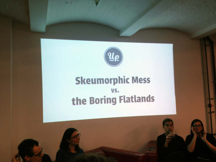
Last week our very own Sarah Lincoln (right) took part in Upfront’s panel discussion entitled: Skeumorphic Mess vs. the Boring Flatlands: What’s a Digitally Native User Interface? She was more than likely included on the panel to argue in favor of “The Boring Flatlands” with reference to her recent work on the new Ableton.com.
Amongst 4 other talented individuals including Conor Delahunty (@conordelahunty), David Kjelkerud (@davidkjelkerud), Kristin Gräfe—who, by the way, was a former intern at our Berlin office—(@kristinonair), and Timothy Achumba (@iam_timm), they discussed the topic, some more in favor of the flat look, some in between, and some for skeuomorphic stuff.
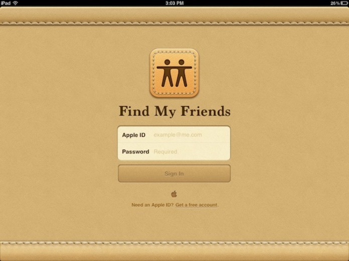
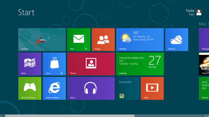
If you’re not familiar with the two, a basic rule is: Apple, with all it’s faux surface textures and beautiful hyper realistic icons = skeuomorphic, where as Metro (“The New Windows 8 UI”, as per their recent name change…) = flat.
 Skeumorphic Mess ...
 vs. the Boring Flatlands?
There were probably over 100 people who came out to the talk, most of which I would say were largely in favor of Flat UI, for one reason or another. The general arguments for Flat user interfaces were mostly based around having smart gestural patterns and there being less clutter getting between the user and the interface. While the arguments for skeuomorphism were based around the notion that adding real world elements into the UI helps the user understand what something does since they’re already familiar with the objects. Everyone had valid reasons for making the design decisions they do, however for me the most logical points came from the ones who didn’t claim one direction as their own. Conor Delahunty had the excellent point that as designers we don’t have to pick a side. Neither is better than the other, and we should simply evaluate what the problems we’re trying to solve are and use whichever method will do that the best. He went on to put out the argument of flat design being more ’honest’ (as it’s been labeled many times throughout the blogosphere) and pointed out that no matter what the end design looks and interacts like, everything on the screen it made up of a square coloured light.
In the end of course as predicted by the MC himself, no conclusion was reached as to which is better than the other, the reason for this I believe is that all members, whether they expressed it or not seemed to agree on the fact that flat design doesn’t make a good interface, and skeuomorphism doesn’t make a bad interface. We should design interfaces to make the function of them easy to understand. If that means adding a paper texture in that particular scenario, then that’s great. If it means having an application which is a blank white screen and lets you type this blog post without distraction, that’s also great.
Open for discussion: @ScottSavarie, @edenspiekermann.
Photo: Matt Berridge