Article
Say it with a picto

Correspondence between Espi-Berlin and Espi-Amsterdam while fine-tuning a pictogram:
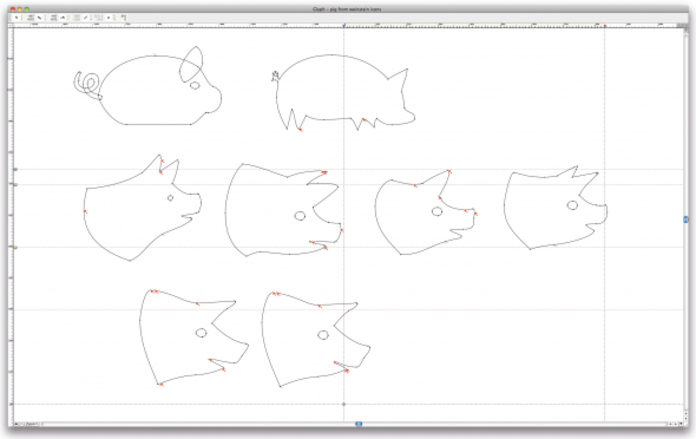
– Groetjes Joost! Here are the pigs nervously waiting for your judgement. All of them want to win the casting – some have had plastic surgery just for you: Number 3 got new ears and Number 1 has a bigger mouth now :-)
– Hi Doctor Julia, You did a great nose job, and with this new ears Pig Number 3 is the winner. Cheers, Joost
Pictograms live their own life. They can be sad, happy, smart, lazy, cool, technical, humane, relaxed, tense … and exactly right for the brand. Or not. We see them everywhere but don't always notice them – unless they have something "special" or if they just don’t work. We easily forget their important function in visual communication.
Actually all of our written language systems started with pictogram-style symbols about 6000 years ago. The oldest writing methods used of a mix of pictographic and logographic signs, and also our alphabet is derived from them. As an example – the letter A comes from the sign “aleph”, the pictograph depicting the head of an ox.
In the nineteen-twenties, pictograms in the modern sense of the word were born. Initially they were developed with the aim to make science and politics understandable to the wide public. Best known for this is the Isotype Institute in Vienna founded by Otto Neurath, an Austrian philosopher of science and sociologist. Isotype (International System of Typographic Picture Education) is a method of presenting social, technological, scientific and historical facts in pictorial form. It had and still has an immense impact on information design in general.
Today, with service design and user experience playing an ever increasing role, pictograms are becoming very popular as a means of making complex contexts understandable in a quick and easy way. They function internationally, across language and cultural barriers. And across media barriers as well: They take part in a user’s journey through digital media, enable intuitive user guidance and transport brand values even on the smallest mobile interfaces.
Pictograms have nowadays more and more become identity makers. Designing them is no longer about finding the one and only ideal neutral form (as was for example Otl Eicher’s aim in the nineteen seventies), but about creating images which fit to a brand and transport emotions. Not neglecting of course their primary function: to be clear symbols for the concepts they stand for.
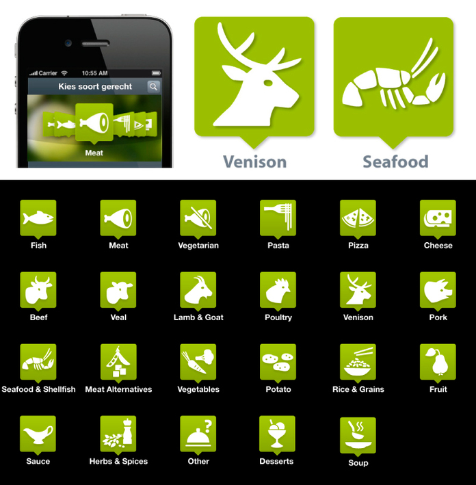
So, at Edenspiekermann we treat pictograms as a decisive part of a brand identity. And as a part of the services a company has to offer. To develop and design a pictogram means to indulge deeply in the functions it describes and to get insight in the company's philosophy, core services and processes. And to reflect on the client's target and user groups. When creating a pictogram family we want it to work as a team of busy little helpers and simultaneously make a brand come to life.
Rabobank
Our client Rabobank offers a huge range of financial products and web applications. Their product and service icons are a true part of the brand. They help clarify and structure the services of the bank and make things easily accessible. The clear outline forms are based on the typeface Myriad which is Rabobank's corporate font. Their smugly round, visually slow appearance adds the element of trustfulness to the brand identity.
![]()
ICS Bank
Another example from the financial sector: A sympathetic, friendly impression is given first priority in the design here. The pictograms tell us that finances are not necessarily something complicated and that the bank’s sevices are very easy to use.
![]()
visitBerlin
visitBerlin is a platform for tourists and other visitors to the German capital. We designed an extensive pictogram family which has the challenging job to provide a quick survey over the almost endless possibilities this vibrating city has to offer. The brand colors are used as an additional distinction mark.
![]()
Sentres
Sentres is platform for sustainable tourism to promote the region of South Tyrol. Our client Geo Marketing in Bozen, Italy wanted us to design a website with tailor-made services, strictly connected to the brand. We did the branding, interaction design, usability testing for website and the app. In the centre of the sentres design were, once again, pictograms, as most useful roadsigns to the user.Pictograms that function as emplematic images for the region of South Tyrol. They seem to indorporate the spirit of the area – at the same time giving just functional information.
![]()
Pig Number 3 after plastic surgery, together with fellow pictograms for the digital wine steward WineStein, winner of a Red Dot Award in 2011.
Pictures: Edenspiekermann