Article
Screen = Bad Paper

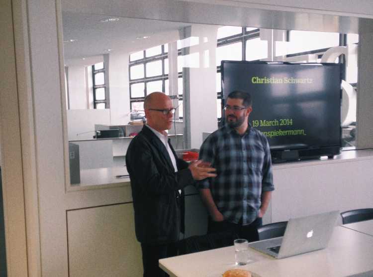
Christian Schwartz’ career started in the late 90’s working with Erik Spiekermann. Together they designed exclusive fonts for Bosch and Deutsche Bahn as well as FF Unit or the FF MetaSerif.
So today – where does his inspiration come from?
Of course modern interpretation of historical fonts might work as a source for type designers. Many are “borrowing from ancient times” and then building a modern equivalent. Things operate vice versa, too e.g. a typeface created in 2011 for the Empire State Building with the look of the 1930’s …
No more handwriting?
Not at all … For the 2011 Africa Cup of Nations Schwartz and his team created fonts using good old paper, brushes and scissors to create a casual look.
As a nice take away for the web, here’s the pragmatists formula for creating awesome fonts: screen = bad paper, meaning if it works on bad paper (with sucking ink or limited space) it definitely works on the internet.