Article
It’s all about the numbers

CBS, Statistics Netherlands, gathers and processes huge amounts of data in order to enable local and national governments and companies in the Netherlands to take the right decisions. Collecting and sharing numbers are the key activities of CBS. We made this visible by introducing the usage of numerical data in all communications. These numbers are taken directly out of the CBS databases.
Accessible data
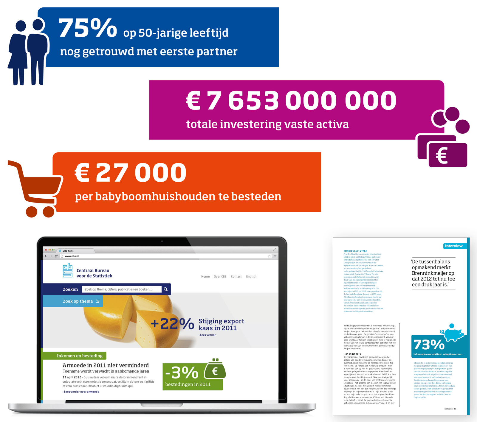
CBS authors are often scientists who are very involved with their data. They love to make large tables that are scientifically accurate but not very accessible for the general audience. So we created tools to help them visualise the data in order to appeal to a larger audience. Other organisations use text streamers to draw readers into a story. For CBS we created banners with key figures for this purpose. This forces authors and editors to extract these figures from their data. It is a way to make the content accessible through on- and offline media that is unique for CBS since no other organisation is able to produce these accurate figures in everything they publish.
![]()
We made a dedicated collection of 60 thematic illustrations to exemplify key figures. We wanted to ensure that these illustrations were used in a consistent manner, therefore we created them as an icon font. This makes them very easy to use throughout all print and screen media. Over time, this font can easily be extended with additional illustrations.
Inspired by graphs
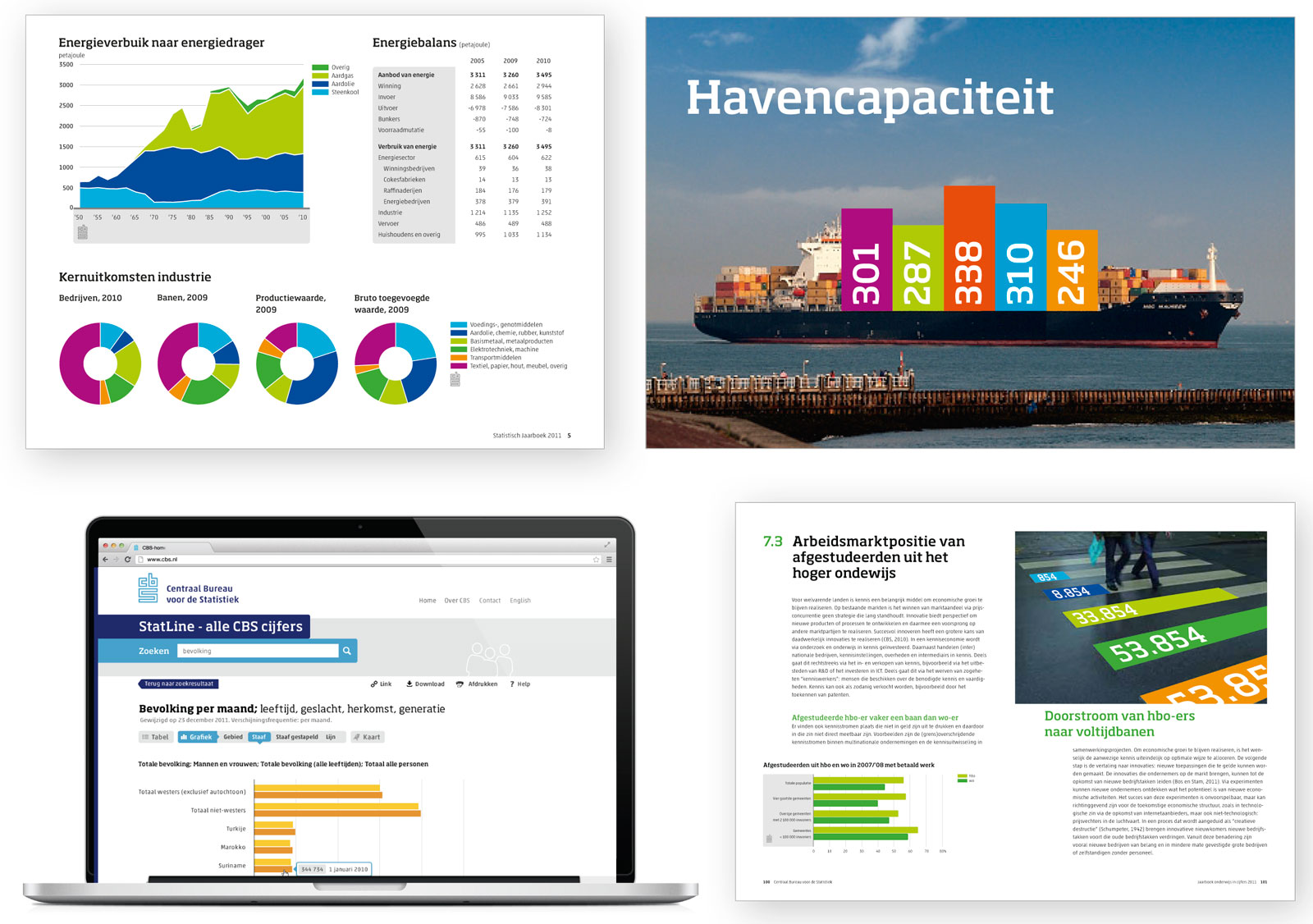
We started the development of the new corporate identity with a workshop with stakeholders from all departments and levels of the organisation. Together we established the starting points and the requirements of the new visual identity. It soon became evident that figures and infographics are the key elements in all CBS communications.
Therefore we started the development of the new visual identity from these elements. We developed a distinct and recognisable style for infographics in print and on screen. The colour palette was carefully chosen based on optimum contrast in graphs. In the workshop we learned that no palette can be both clear and completely colourblind proof. We decided to give the colours used in graphs a fixed order with maximum contrast between neighbouring colours and separate these colours by white lines.* Of course every CBS website has to comply with W3C rules, so we tested all colour combinations for onscreen use as well.** We gave the existing logo a makeover and optimized it for screen applications.
Tables are also widely used by CBS and are often quite complex. The Akko typeface by Akira Kobayashi was selected for its good legibility in small sizes in tables.
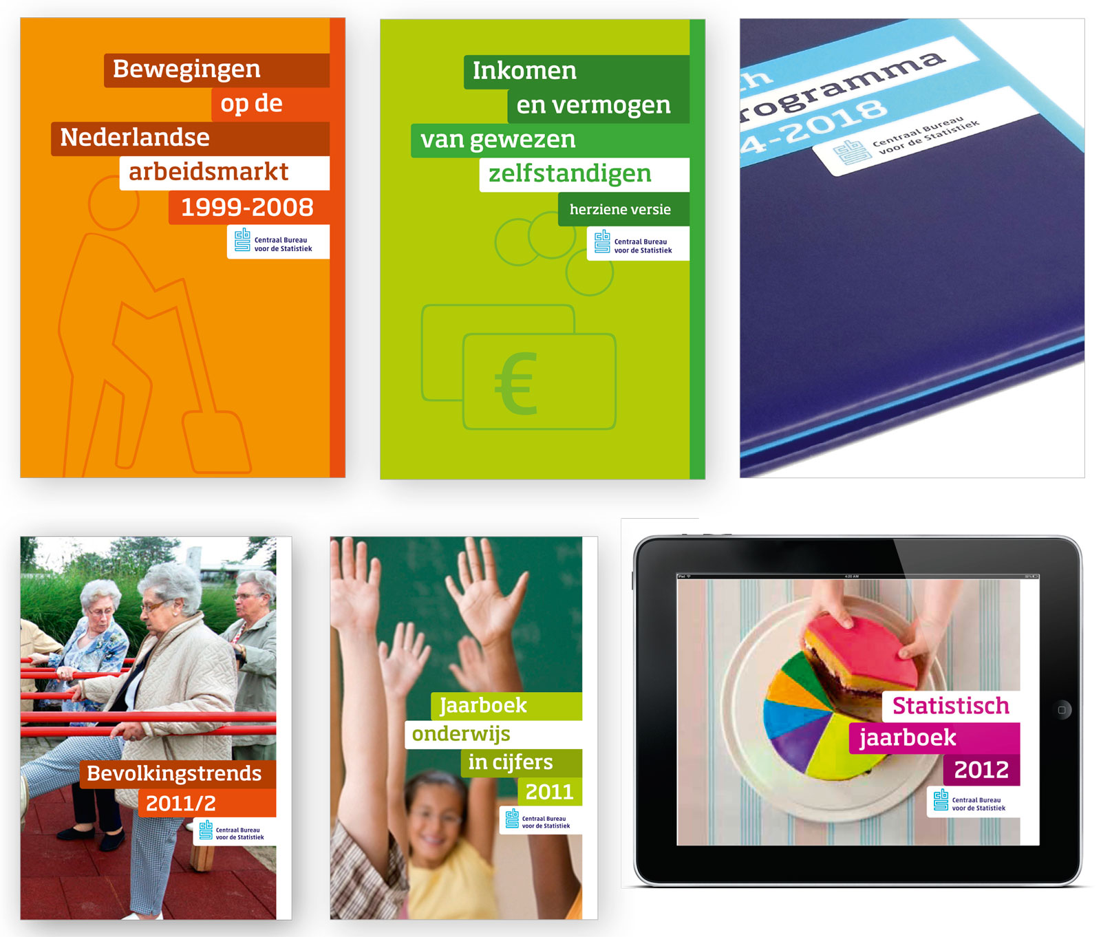 Cover sketches for papers and (e-)books
A different tone of voice for different target groups
CBS adresses many different target groups, both professionals and a broader audience. We developed a system to diversify the communication to fit the needs of each target audience.
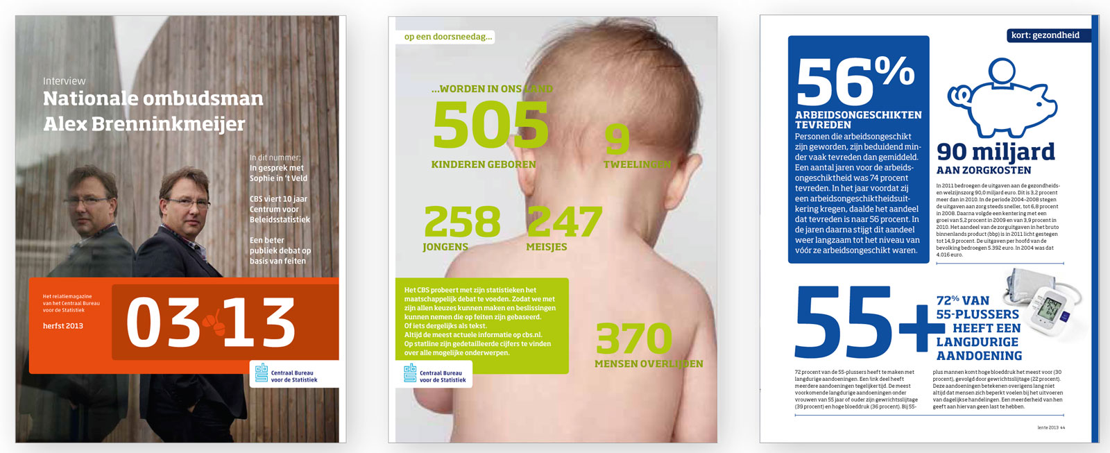 Magazine for relations (sketches)
The new corporate identity will be fully implemented during the final half of 2013.
_
Notes_
- Checking colourblind view: in Adobe Illustrator view/proofsetup, check for protanopia and deuteranopia
** Test of onscreen contrasts with “Colour contrast analyser” by Cédric Trévisan and Steven Faulkner