Article
Mozilla Fira Fox

Type is part of the brand performance and of a company’s success – specially if the service they offer has directly to do with displaying type and providing information. We had the chance to work for an exciting client in that field. But first, let’s make things clear: What exactly is type and typography?
Typography – to design words, text, written content within a print or digital project – is a vital subdivision of graphic and corporate design. Nothing we have not heard yet. However, Typography is also an independent, highly complex field, when it comes to designing the type itself, that is: each and every single letter. Plus numbers and punctuation marks. Invent them and put them into shape. Typography can refer to creating a new typeface from scratch for a client and for particular applications.
Edenspiekermann offers both: design typefaces from scratch, plan a system of related weights or versions, produce fonts for different platforms and make them work on all kinds of devices and displays. This might sound harmless, but is the most important and time consuming part in today’s digital design world.
We need a font
On one hand, when clients say “we need a font”, it means our task is to find the most suitable typeface or type family for them, from a variety of existing fonts. The chosen one should match the face of the business, the brand, the label, the people behind it, their products and services. On the other hand, clients who say “we need a font” might also challenge us to invent one – their own unique corporate typeface. Perhaps even that typeface itself is part of their services. From here on it becomes even more exciting. Let’s clarify.
Type as part of a brand’s performance
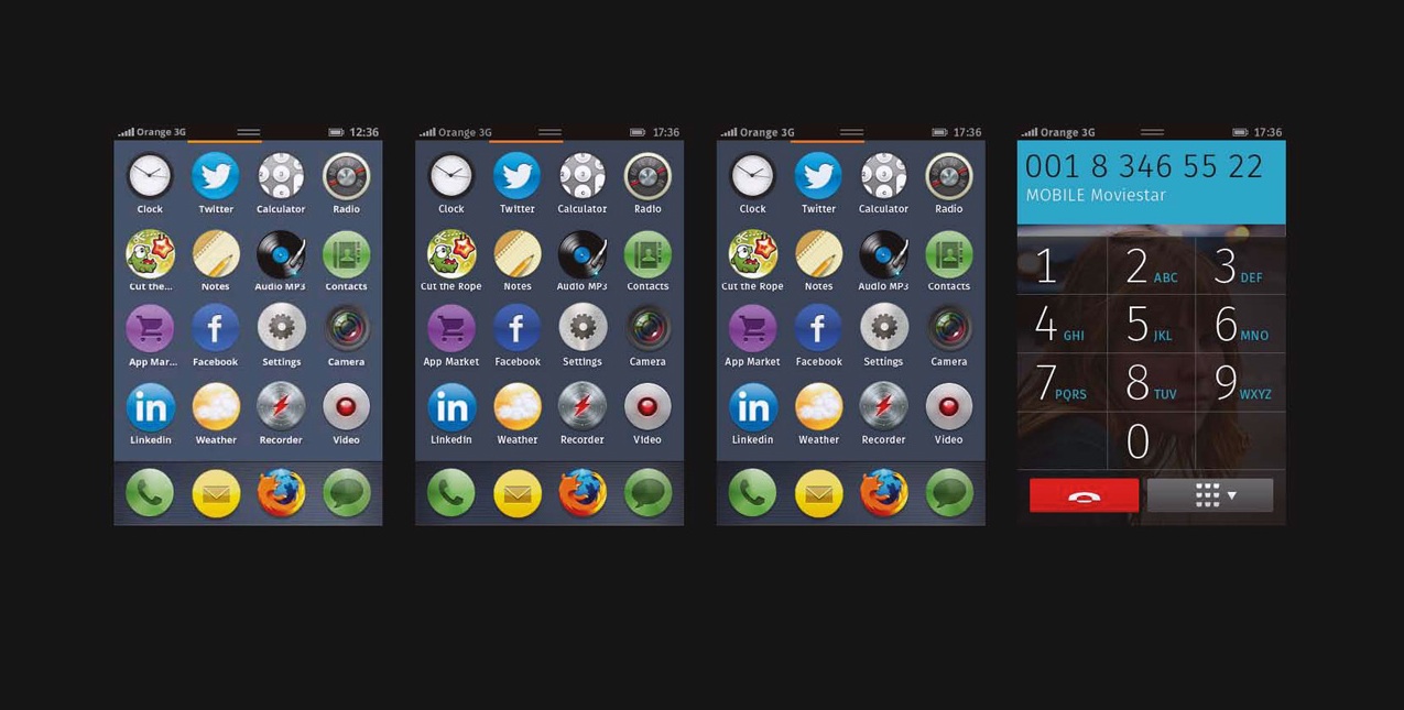
This applies to the Mozilla’s web browser. Mozilla Firefox should look appealing on every screen worldwide und be easily readable. The Mozilla font must function in every size, language, and across numerous digital platforms. Mozilla’s corporate font was FF Meta by Erik Spiekermann. This became the basis for the new Mozilla font. An important wish from the client was to build the font “open source” (for operators to add and for continuing usage by the public).
Phase 1: To create a foundation
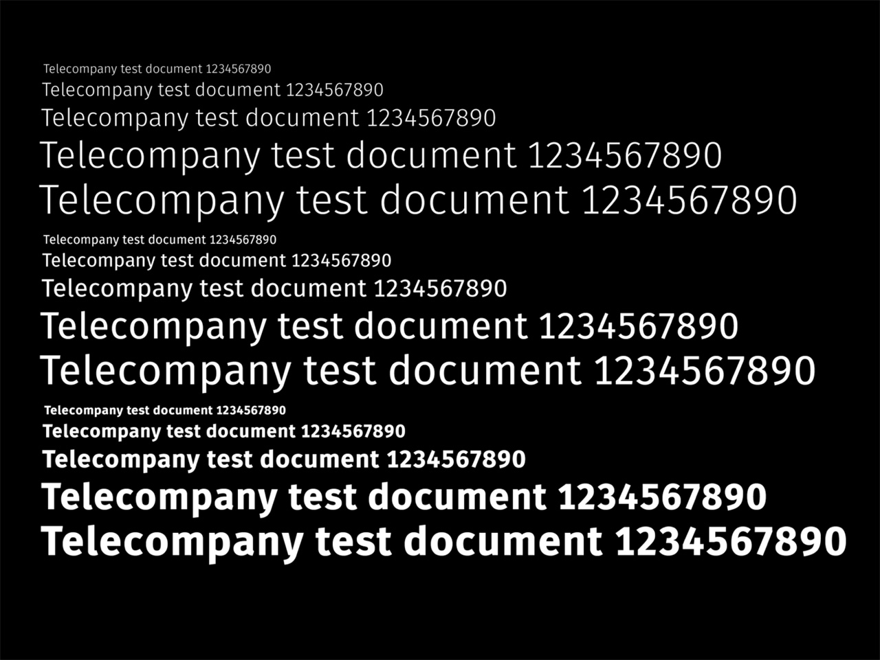
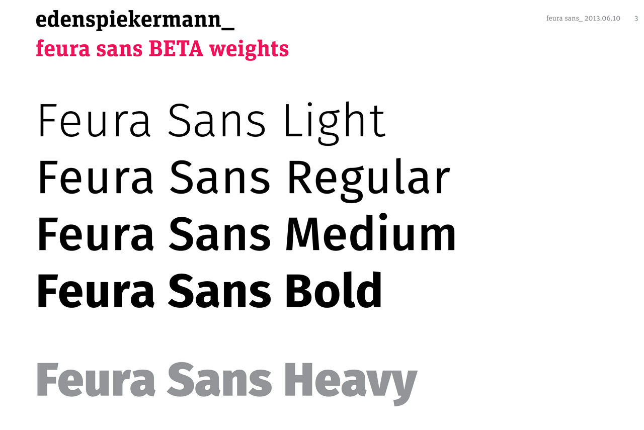
Our first challenge was the concept: What route do we want to take? What should the qualities of the typeface be? How many weights would we need? The groundwork was done in collaboration with the client – the companies Telefónica and Mozilla. First we developed a beta version of the typeface and made first fonts for testing and presentation. Then we continued to work on how and where to improve it in detail. At this stage Mozilla asked for a Sans Serif in three styles (regular, medium und bold). They were then made ready to be tested as fully functioning fonts.
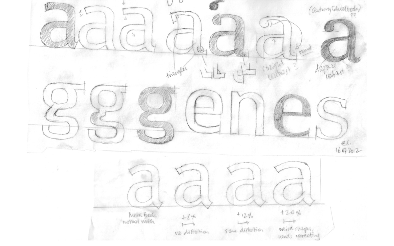 The very first sketches already anticipate the final look
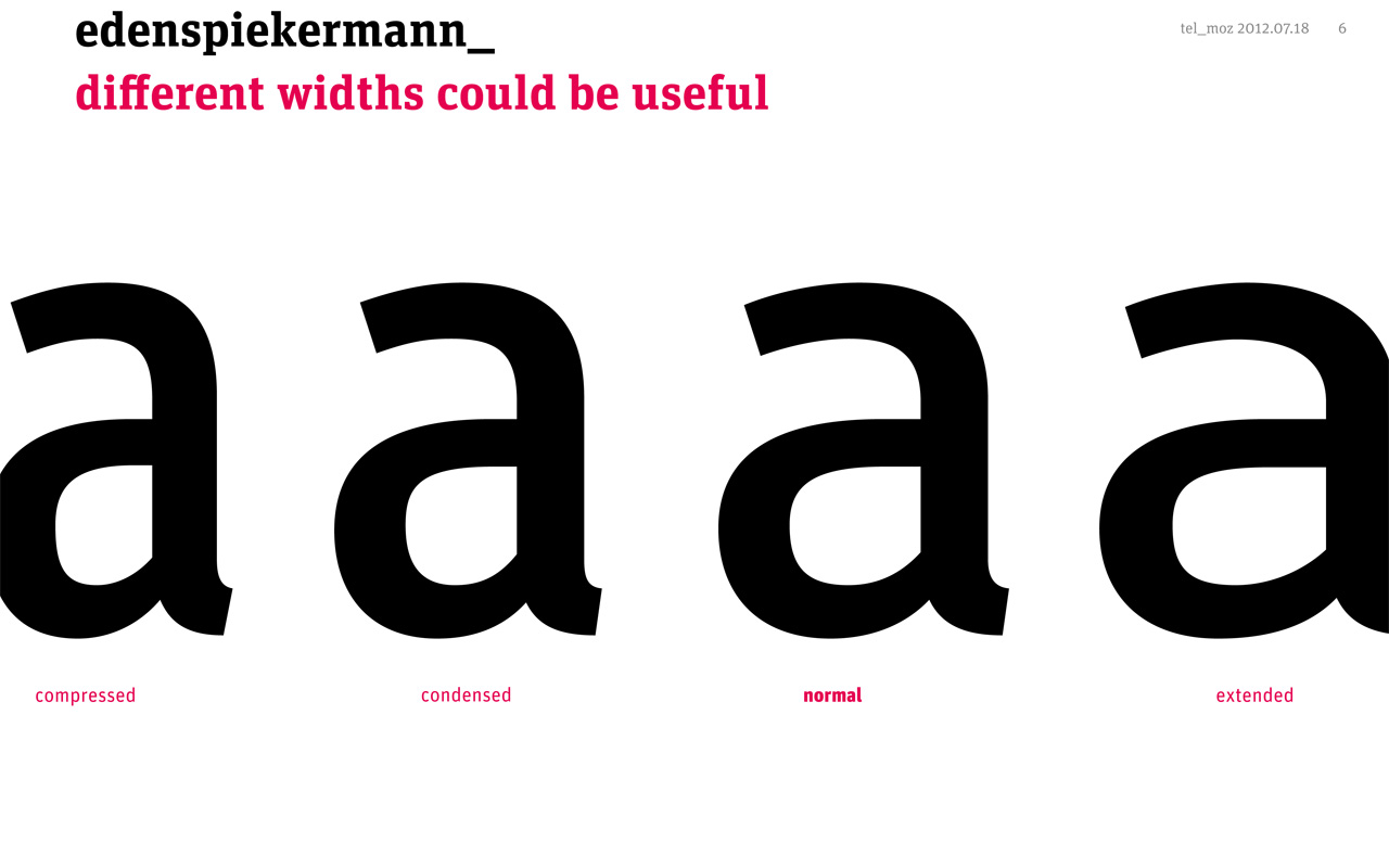 From sketch to presenting possible forms.
The working process and internal coordination took about a year, from initiating the project in June 2012 until the release of the completed fonts mid 2013.
Phase 2: Who when how what?
Speaking from our experience, in phase 1 we could define the continuing procedure: Who delivers what, where do we need to rework, what other languages (character sets) do we need?
The language systems for Mozilla included (next to Latin for the Americas and West Europe) Greek and Cyrillic. Additional weights like extra bold and styles like monospace and italics grew with the advancement in technology for diverse web applications. Ralph du Carrois and Andreas Eigendorf were responsible for creating the fonts and also did the hinting (optimization of the font for displays).
And after that: Continuing on demand (on budget)
Here we also had a test phase for distribution and application of the fonts. More weigths like “ultra light” and a “black” were drawn and joined the family. This is an approach we generally recommend for the development of new typefaces and corporate fonts: first build the basis and test the operation, then enhance the fonts step by step for more applications and linguistic regions.
It is extremely helpful to have someone from the client’s team participate in the process – at this point many thanks to Patryk Adamczyk, User Interface Designer at Mozilla.
Crucial as well is that our own project manager has a certain affinity towards type, and enough knowledge of the topic to correctly advise the client. We need to give good advice and to understand what our client needs. Also in special cases we know what has to be accomplished to strengthen a brand and support all its manifestations with a suitable typeface.
The special quality of type projects
Designing type means offering choices and being able to select the most useful and pragmatically appropriate one. The motivation can lie behind the creative means to find a corporate typeface that fits the corporate design; but can also rely on technical demands like in the case of Mozilla; or even be explained by the fact that new browsers and mobile applications force a company to present their brand appropriately.
Well, what does differentiate type projects from other projects? „The long-term nature“, project manager Christine Sunkel responds, “the complexity.” She continues, “and the fact of making an intangible thing tangible.” Most people who have “little knowledge of type” cannot immediately grasp the processes that lie behind them, because most use them subconsciously. It took “trust in the competence of the agency to do what is right”, because we “know to our great fortune what it should look like.”
Clients with type projects need to let go. This can only happen if they are certain that the agency knows exactly what to do. The designers, working on various scribbles (letterform, weights, figures, punctuation marks etc.), need to keep in mind the combination of all of these factors and finally the overall effect. Sunkel points out that type is a “huge system”. She now takes a great delight in type projects: “They build on one another”. And yet we once again move naturally “in a pretentious world”.
Good old technical documentation
Back to the methodology: From the first appearance of the case to the completed project – which is rather holding on to the status quo, since a typeface is never really fully finished. So we created a Font Map for Mozilla. Within the meaning of the good old technical documentation this presents an overall picture of what is planned, what is already done and what possibly needs to be added on.
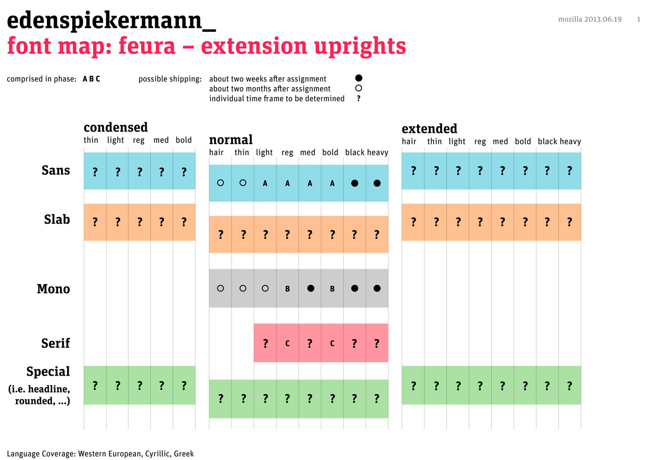 A fontmap is an overview that evaluates the planned structure of the typeface and the current state of the process. It shows us what we need as far as the typeface goes and tells the client and us how to plan and calculate for our project.
Additionally to letters in diverse language systems the components of a typeface include special characters, figures and symbols (icons, pictograms). Often they are shaped particularly for specific clients, brands and uses.
Every font needs a name
Also a very exciting point: Fonts have names. The name of the new Mozilla font has been discussed extensively. Out of “Feura”, pronounced in English like the German word “Führer” and thus arising uncomfortable associations, became „Fira“.
Most recently Fira had been released as brand new data with 16 weights (ranging from way too thin to very fat) ready to download on the website of Carrois Type Design. Since July 2013 Fira Sans has been posted on GitHub for free download and open source. “Designed to integrate with the character of the OS, the Fira Sans typeface also aims to cover the legibility needs for a large range of handsets varying in screen quality and rendering”: Fira Sans in Mozilla’s style guide. Here you find Fira Sans presented in a very nice way, plus Fira Sans and Mozilla Firefox on Wikipedia.
Read more in German: An (internal) lecture by Erik Spiekermann, showing an overview of font projects at Edenspiekermann. /// Erik Spiekermann präsentiert Schriftprojekte: Kreuzzug gegen senkrechte Linien. – More adventures in corporate design: Things that can happen to a well-designed letter. /// Was mit einem gut gestalteten Buchstaben passieren kann: Das lächelnde g.