Article
Serious Fun: Co-creating Amsterdam

Really involving and inspiring a communication department takes more than just practical tools and guidelines. Last year we updated the corporate identity of the City of Amsterdam, in a joint project with design agency Thonik. As usual when we introduce a new corporate identity, we paid a lot of attention to facilitating the users with the proper templates, online tools, an introduction video and a styleguide.
But in order for any corporate identity to succeed, the users have to gain a deeper understanding and feel that the style is really theirs. So we organized a co-creation workshop for the Amsterdam communication professionals. After a short introduction we split them up into small groups and put them to work. They worked at different mobile workstations that were especially designed to address three key features of the new identity. Each session took 20 minutes.
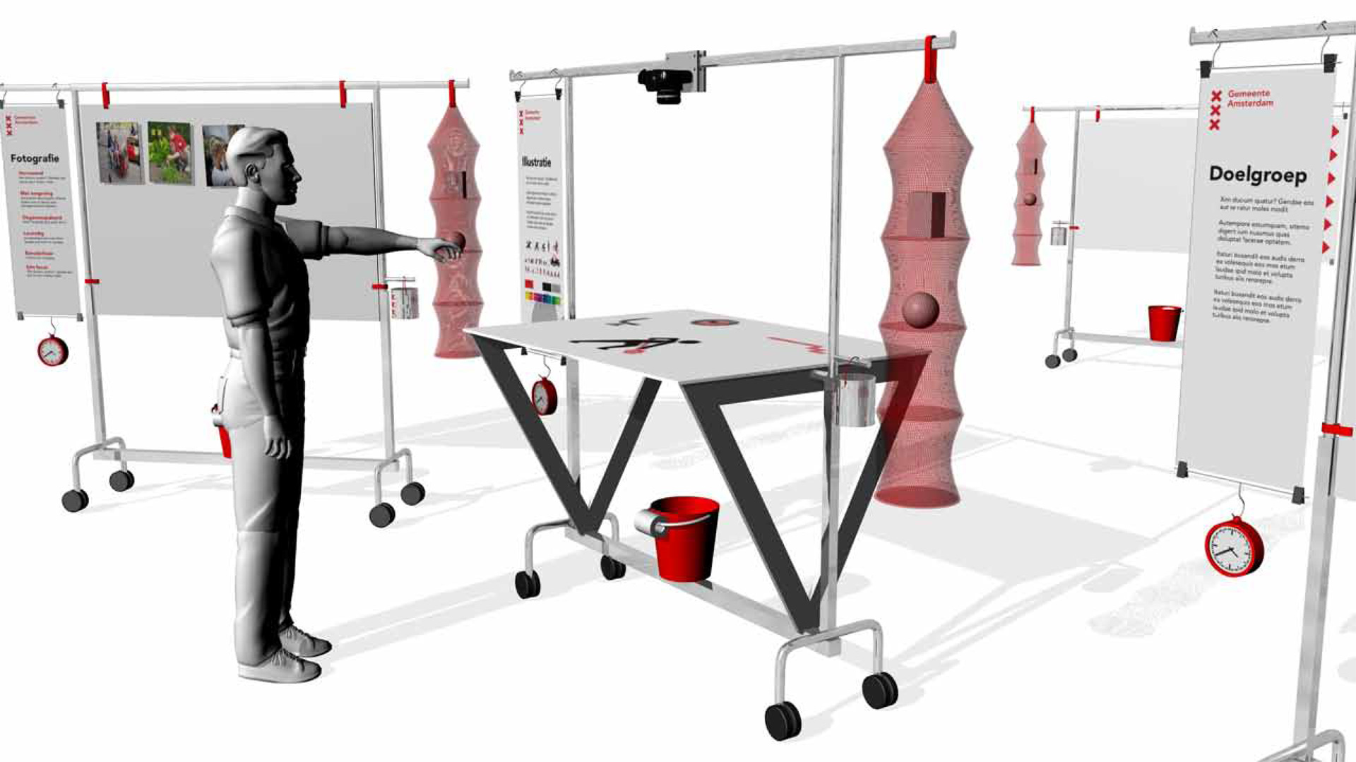 Design of the mobile workstations
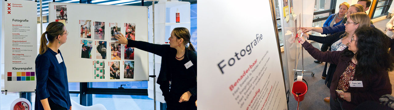
Photography and colors
In this session the task was to make an A5 brochure cover. First decide on a subject and a target audience. Then find the most appropriate photo in a stack of examples, think of a title and finally pick a supporting color. This way the participants experienced first hand that the message is both in the image and in the title and that it is usually more interesting if there is a little tension between those two. Also they felt the designers’ dilemma of where to put the colorfield and text. The result is that they are now better equipped to brief designers and judge proposals.
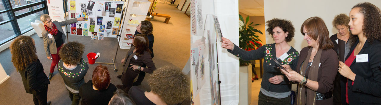
 Deciding on illustrations
Illustrations are a relatively new element in the corporate identity of Amsterdam. We combined it in this session with the recurring dilemma of how to address a younger audience with a corporate style. The participants were asked to plot a range of illustrations on an axis from a young to an old target audience. After that they had to decide which of the illustrations fitted the Amsterdam style and which were definitely a no-go. This led to interesting discussions of how far you can go in order to reach a specific age group while still be recognizable as the City of Amsterdam. After some debate there was a broad common understanding of the type of illustrations that can be used.
 Playing with icons
An important addition to the identity are the icons of Adam and Eve: two versatile tools to create illustrations and animations. In order to experience the possibilities of these new icons we created a puppet version and some accessories to play around with. This was a pretty accurate low tech version of the digital tool we made for designers who work with these icons.
The group was asked to make a short script for an animated story and produce it using stop motion technology. This resulted in a lot of fun and the video below, which is the combined version of three sessions. The communication professionals now have a good understanding of the possibilities of this new tool.
Disclaimer
The photos and illustrations used in the workshop are examples and most of them were not made for Amsterdam.