Article
How to visualize spatiality
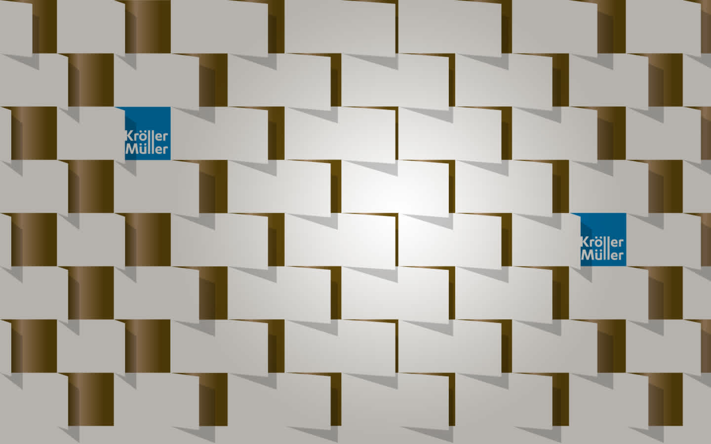
Anyone who has been in the Kröller-Müller Museum remembers the airy building with its large windows generating a view on the sculpture garden and the surrounding national park. The interplay between inside and outside has been the starting point of our visual identity for the museum. But how do you make spatiality tangible in different media?
Nature as the fundamental idea
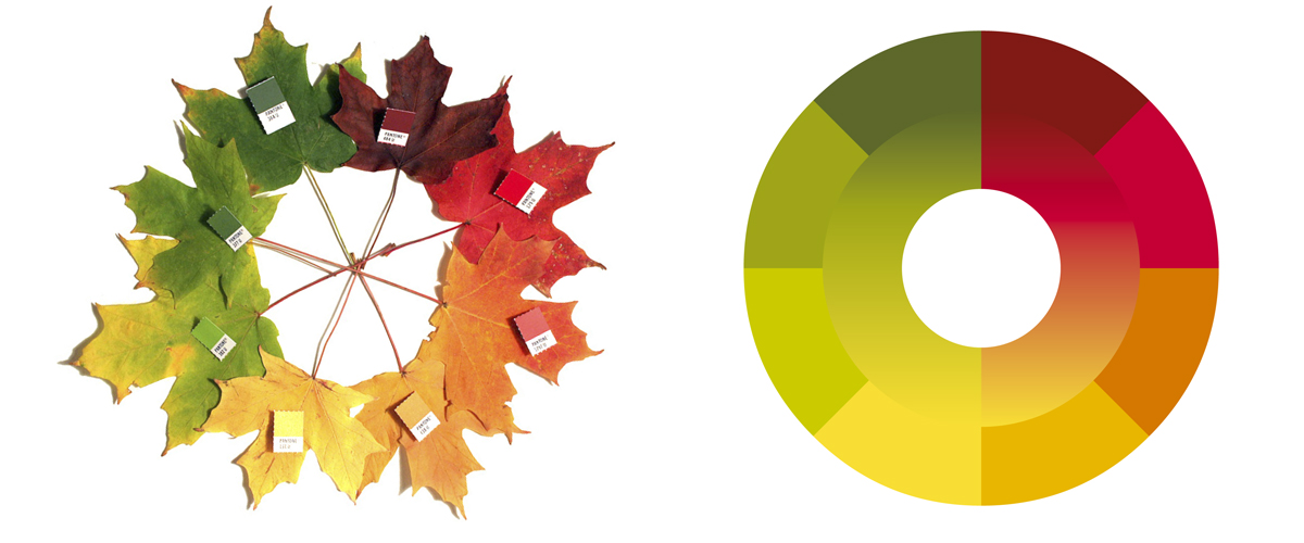
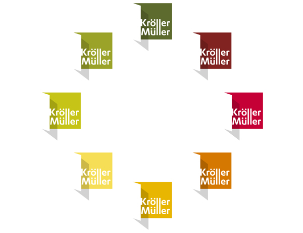
While developing the identity we were inspired by nature which is so dominantly present around the museum. We used elements like light and shadow, movement, natural materials and colours from nature.
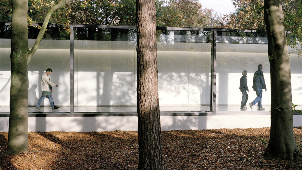 Photo: Walter Herfst

Spatial typography
Early on in the design process, we used the 3D software Cinema4D to generate spatial sketches. We normally use this software only to visualize our spatial designs, but this time it played a significant role in our concept development. We used it to design the logo, which pops up from – and disappears into – the background. Using that same principle, we also animated the typography. During testing, the Karbon typeface by Kris Sowersby turned out to be the ideal choice for spatial type because of its simple shapes, but it also worked beautifully for body copy.
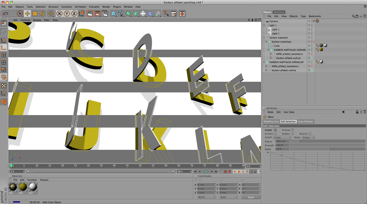 Three-dimensional type sketching in Cinema4D
During the sketching phase, we discovered what worked and what didn’t. The ultimate spatial typeface is based on these insights:
• Caps work better than lower case
• Opening the type on the right side appears most natural
• To keep the typeface simple and readable, we left out the vertical perspective; the letter opens up only horizontally
• The typeface is made up of four layers: the rest-form, shadow, fold out and thickness
• The shadow layer is a grey tone set on multiply and therefore picks up colour from the layer below
• Three opening angles work best: 10, 40 and 70 degrees
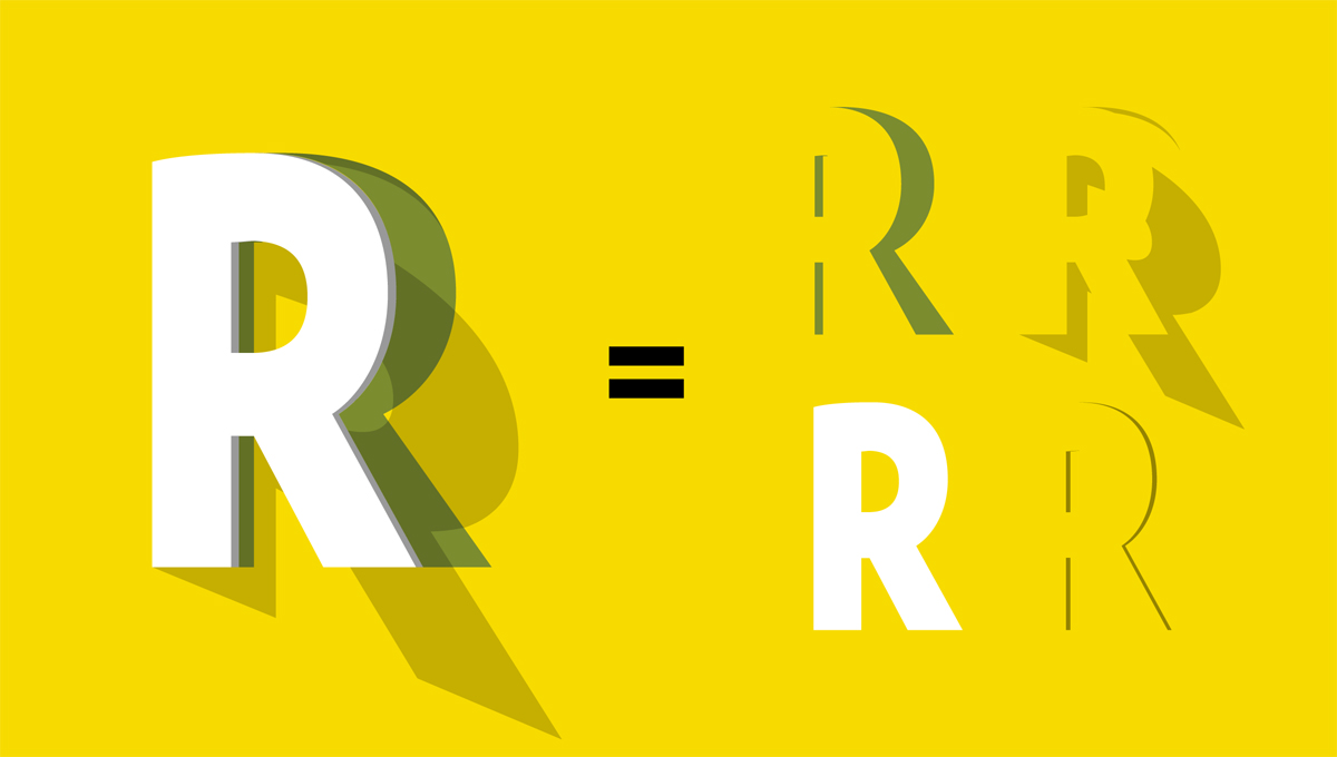 Each character is made up of four layers (four separate font weights) which are stacked on top of each other
Subsequently, we made vector files of all letter shapes and, using Glyphs, turned it into a typeface. The logo has been incorporated as one of the characters. Now, any text can easily be made in our special Open Type font!
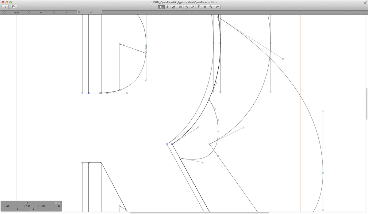 Each layer is turned into a separate font in Glyph
The design process
Design stages often vary between ‘wide’ and ‘narrow’ stages. This wavelike process is also known as the double diamond. You start off with a compact request from the client; this identifies the basis for concept development from which you will spread your creative wings in full width. From all ideas, a design concept is selected and formulated as sharply as possible. From there on, you again widen your scope when designing the various items.
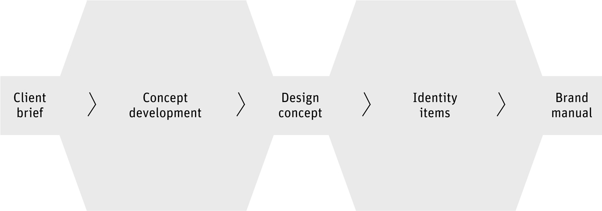
The design process of the Kröller-Müller identity followed pretty much this rhythm. But a few basic principles were only discovered during the process, when we were designing specific items. For example: we discovered that the logo worked best when placed against the edge of the canvas. We also discovered the important role of natural materials in the identity. Such influences are apparent in the envelopes (Kraft paper), the Vincent is Back exhibition design (the yellow carpet with Van Gogh brush stroke pattern), the entrance object (concrete and coated steel) and the Top 75 exhibition (gold leaf).
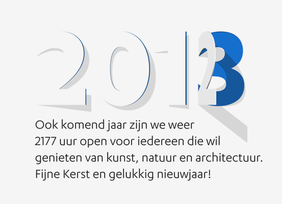 New year’s card
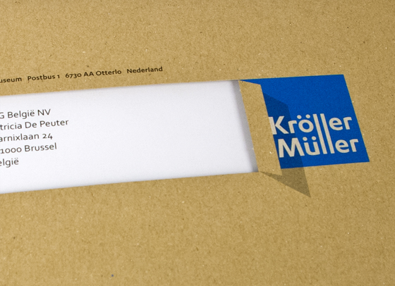 Detail of the Kraft paper envelope
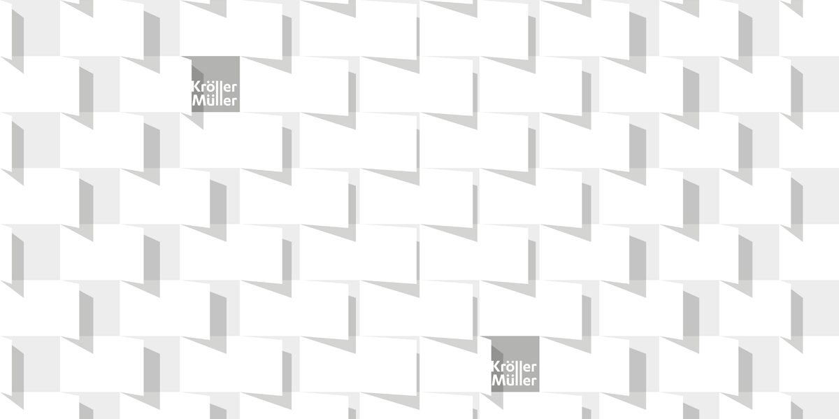 Artwork for the wrapping paper
The new entrance
Since the mid seventies, the museum has a block shaped concrete entrance object. Up until recently, it housed a spatial version of the old logo. We researched a way to naturally incorporate the new logo in the existing concrete block.
In the original design of the entrance object (designed by famous Dutch architect Wim Quist), the hole was filled with a white semi translucent cube. In our new design, we reverted to the cube-in-a-cube concept by giving the logo a volume. Where the 2D version of the logo gives only the impression of spatiality, the cube object now makes the logo truly spatial.
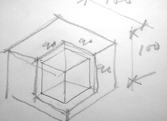 Original sketch by Wim Quist
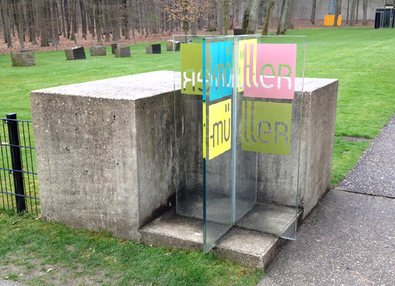 The old logo in the object
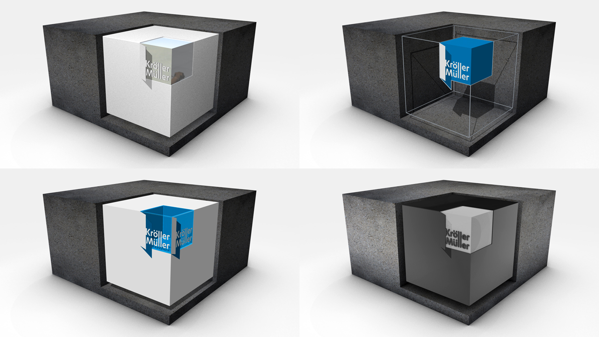 Different material studies
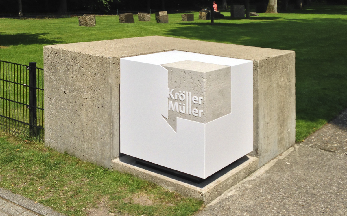 The final result
Jubilee exhibition in gold
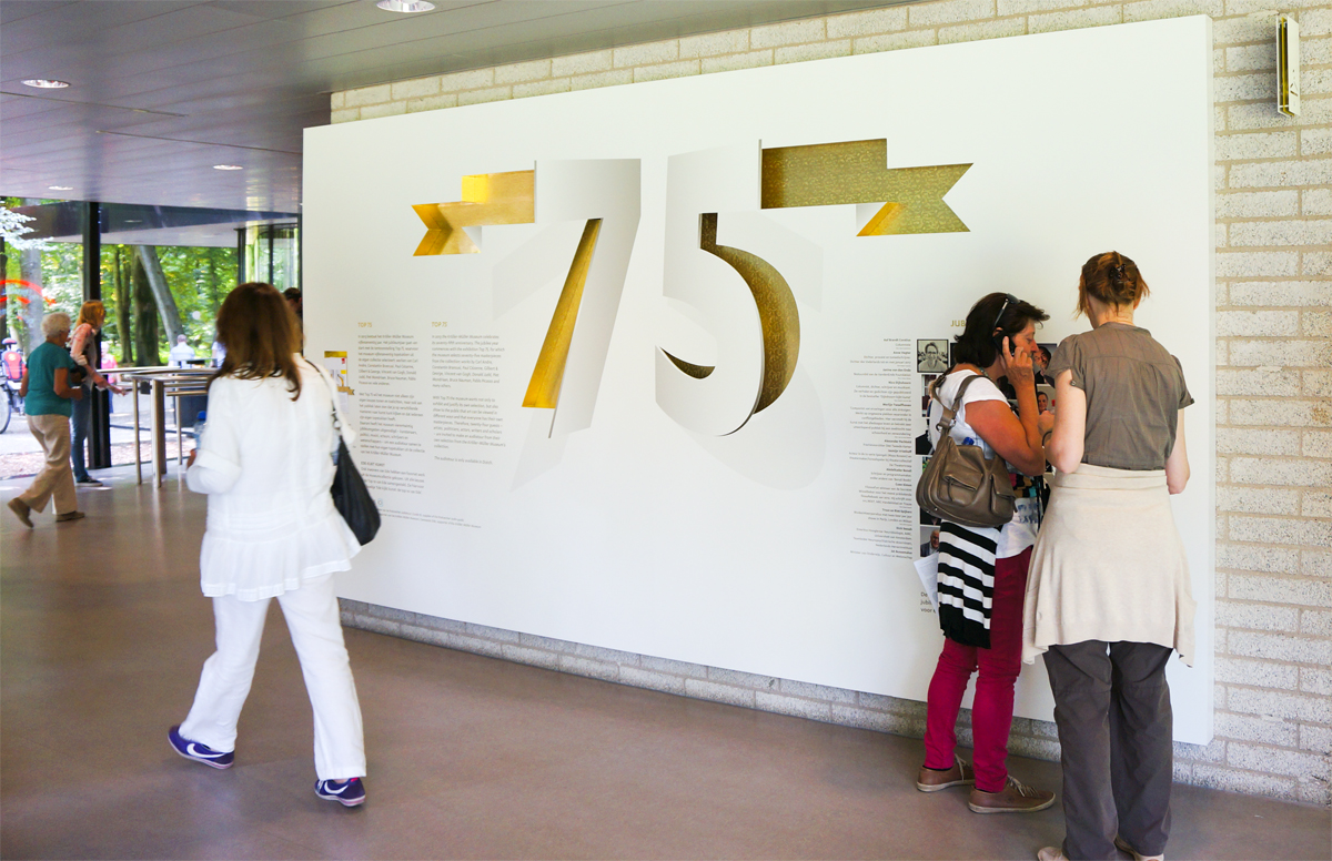
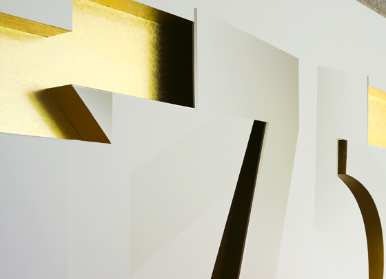
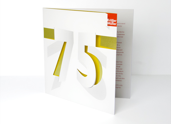
Our most recent work is the design for the Top 75 exhibition, honouring the 75th jubilee of the Kröller-Müller Museum. For the jubilee logo, we searched for a more luxurious version of the open type concept. We made a new typographic rendering in Cinema4D in which two numerals open up on opposite sides and we filled the inside with gold leaf. The logo has been spatially incorporated into the introduction wall of the exhibition.
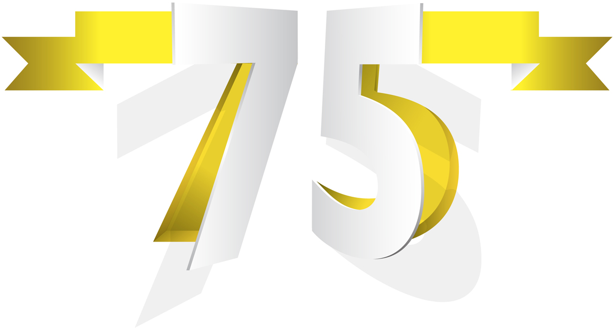
And back into full width
This summer we have reached the final stage of the double diamond. All insights about the identity and its applications are recorded in a compact brand manual. This document will provide inspiration to continue the search of new possibilities in the full width again in order to come up with new implementations of spatiality, again and again!