Article
Pictograms: Past, Present, & Future

In my work here at Edenspiekermann, I’ve designed pictograms for both print and online, covering projects like Bosch, Liberty Global, Vorablesen and Red Bull Amaphiko. Although they’re only small, they’re an integral part of branding, websites and daily life.
Pictograms offer language-neutral communication. We see them everyday in the street, at the train station or airport, on product packaging, or on websites; they can explain direction or meaning to many people without relying on one language. Here I’d like to share how pictograms have changed for the online world, and what the future might look like.
What makes a good icon today?
In the past, pictograms were designed mainly for public signs. They were seen in all contexts and from all distances, so were planned with this in mind.
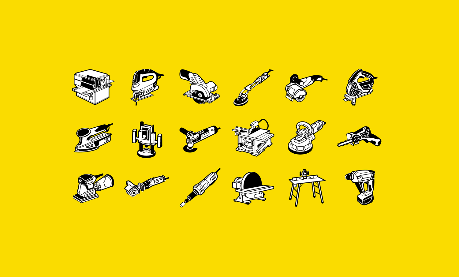
There are also different criteria for print (like the machine icons for Bosch Power Tools packaging). They can be more illustrative than web icons and show product detail because they’re viewed close up and print resolution is advanced enough. But they should still be created as simply as possible, because print resolution can be worse on poorer quality paper. Bosch’s icons are used worldwide—we can’t control the quality of printing everywhere.
Pictograms & optical correction
With Bosch icons, each machine’s details have to be easily recognizable so customers can find the right tools for the right machines. For this we use optical correction, the method of correcting optical illusions. In pictograms, optical illusions can result in the same line thicknesses being viewed differently, or affect how horizontal and vertical lines are viewed.

 Now, in the online era, the criteria for ‘good’ pictograms is very different. They’re normally seen from 50 cm away on a monitor or phone screen, and websites use geometric icons with pixel accuracy. Sharp display is the main requirement for icons online, so they don’t need optical correction.
 So do we still need optical correction for pictograms? Yes, and no. First, the “no”: small, optically-corrected icons are blurred on old monitors, but geometric and pixel-perfect icons display clearly. That’s why web icons today are usually designed to be pixel-accurate, not optically-corrected (although Mac retina displays show icon detail very clearly).
There are also new data formats, like SVG icons and icon fonts. They’re regarded as the magical icons for web—they can be scaled to any size and the edges and curves always stay sharp, the icon colors can be changed, and effects can be added. Sounds great, right? As a result, many people think we don’t have to make different sized icons anymore, but they’re wrong, and this is where the “yes” comes in.
 When the icon size on a website is changed, the icon quality is inadequate; if background color or line thickness is changed, then icon form or distance of elements should be changed too. So SVG icons and icon fonts aren’t actually the magical solutions to online pictograms. We still use optical correction for big icons, although smaller icons are designed to be pixel-accurate. Working this way gives both sets of icons varied design options and strengths.

The future of icons
When it comes to future developments, the next step would be responsive icons that change size depending on different browser sizes. But creators will have to make multiple different sized icons for every one responsive icon, which means more work for icon creators—and bigger budgets.
Smart icons, manipulated by code, could have a better chance at realizing icon optimization online. As we’ve already seen, a “one size fits all” icon is not really the ideal. If we could control all graphic elements via code, creators would no longer need to make the different icon sizes and we could finally make optimal icons for online, whatever the size.
Although website programmers would need to understand how optical correction works, this possibility would be very interesting for web icon design. I have a feeling that this development is on the way, and we’ll be seeing perfect web icons everywhere in the near future.