Article
Why we Need Design Thinking in Politics

“Naked girl, covered in Napalm. Five marines Raising the Flag, Mount Suribachi. V for Victory. They remember the pictures. Fifty years from now, they'll have forgotten the war.“ Wag the Dog (1997)
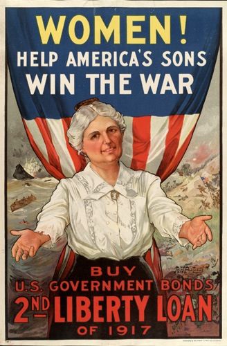
A picture is worth a thousand words, and in politics there are a lot of words. From the early cave paintings in Bhimbetka (dated 13,000 BC to 12,700 BC) humans have used visual methods to describe their own version of events in order to shape public perception. Religion began to spread through the illiterate parts of the world, largely due to the strong iconography that came alongside it. In the 19th century royal families, great conquerors and heroic battles were commemorated in elaborate, gigantic paintings, which solidified the way we think about those events and people hundreds of years later. In the 20th century, politicians used Conscripted Art and propaganda to control public opinion. Thus, when we talk about design in politics, we’re not just thinking about a candidate’s great logo or a movement’s compelling website, we’re considering all the visual elements that project a certain image and message.
Reaching the Global Village
In the 21st century, the age of the internet and social media, we find ourselves in a reality where not having a clear, strong, and– most importantly, memorable– visual identity is not an option. We all live in a global village, and the one language almost all of us speak is the visual language.
As a people, we like to think we’ve come a long way since the days of shameless political propaganda and that we are much more suave now. We won’t be fooled by posters and political infomercials that are trying to bluntly paint a different picture from what we know to be true. The good news is that we are much more sophisticated than that. The bad news is that so are the campaigners.
Social media has contributed massively to the proliferation of design in politics. It’s not just that we focus so often on visual elements as we scroll through media-sharing platforms like Instagram, Twitter, and Facebook; it’s also about the sheer volume of content that is being produced and the rate at which it’s shared. To keep viewers’ interest, you need a graphic language, templates, and constant production. In that way, social media allows smaller movements or campaigns to gain recognition on the basis of their graphic design presence: it’s not just what you say, it’s also how you look.
The Medium is the Message
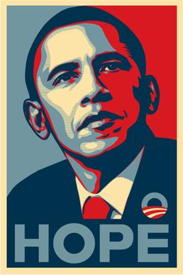
America, in many ways, is a perfect example of how the relationship between design and politics has evolved in the digital era. Many have called Barack Obama “the social media president,“ since he was the first holder of the office to effectively utilize the tools offered by the internet. “The high production value and disciplined branding of the Obama campaigns deserve a great deal of credit for raising the standards of campaign branding, proving that great branding provides a powerful platform to build trust, tell stories, and engage the public imagination,“ writes Deroy Peraza for fastcompany.com.
The Obama campaigns have also showed us once more that Marshall Mcluhan was right when he said in 1964 that “The Medium is the Message“; it is certainly true when it comes to politics. When the Obama campaign reached out to a street artist to create one of the most memorable images for the campaign, they were able to brand Obama as the “cool grassroots candidate.“ Obama got the graphic treatment of a social justice icon, in a very early stage in his career. One can argue that this was a catalyst for him receiving the Nobel peace prize in 2009, after 12 days in office: life imitating art.
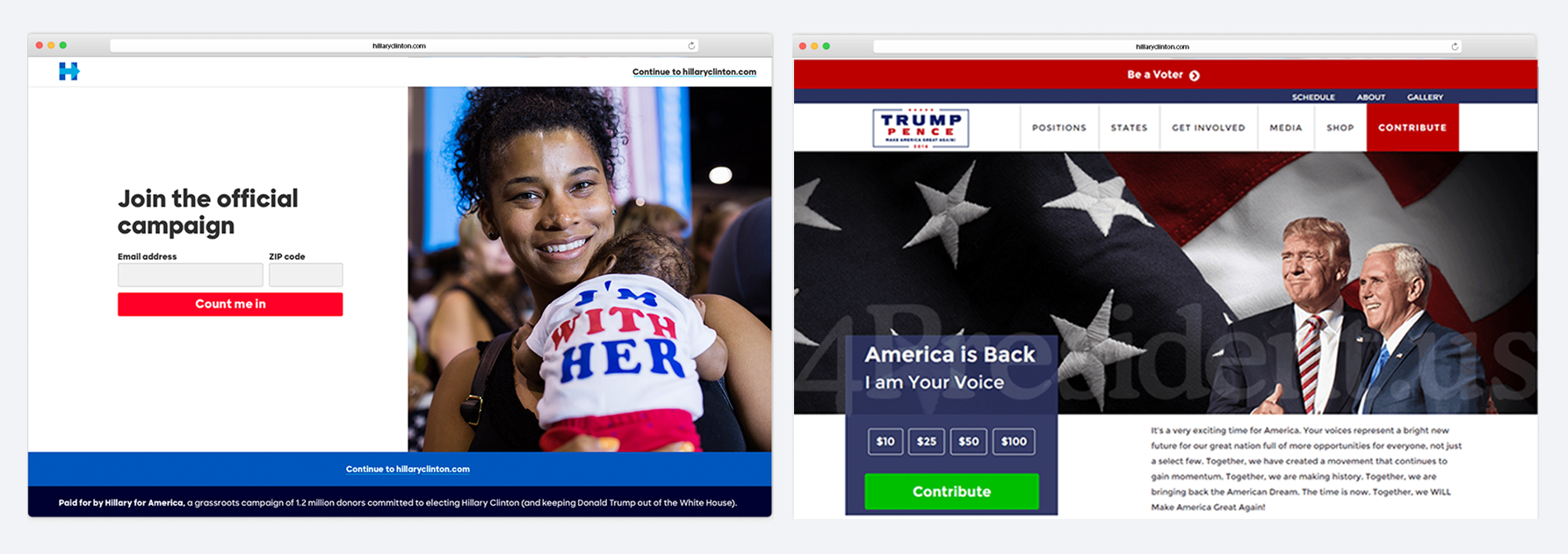
On both sides of the 2016 American presidential election, the design and branding work was very much aligned with the tone of voice of each campaign, although they took very different design paths. Michael Beirut, a designer on the 2016 Clinton campaign, said, “Donald Trump's graphics were easy to dismiss. They combined the design sensibility of the Home Shopping Network with the tone of a Nigerian scam email.“ But this wasn't an oversight. The outdated aesthetic was appealing to Trump’s base, and most importantly was aligned with his key message of going back to “simpler times“ when things were better. If this website was a person, it would be a white middle age man.
On the other hand, almost as a perfect juxtaposition, if Hillary Clinton’s website was a person, it would be a young woman. Clinton’s campaign design was well-thought-out (design work on the campaign had begun two years beforehand), and felt fresh and colorful, with graphic elements that showed progress in the literal sense (the arrow inside the H) and in a more abstract sense (introducing a more innovative design language).
YES and NO
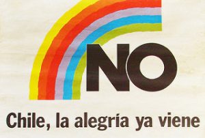
But let’s take a trip outside of the US for a moment, and travel back in time to 1988, when Chile was under the dictatorship of Augusto Pinochet. A national referendum was approaching, an opportunity for the Chilean people to determine whether Pinochet should extend his rule for another eight years. The referendum asked the people of Chile one thing: Augusto Pinochet Ugarte - YES or NO. With only a few months to organize, understaffed and with no budget, the “NO campaign“ went straight to work.
The YES side had the clear advantage of unlimited government funds and the sitting president as their candidate. But even though the NO campaign had been forced into a negative position, they were able to use design language to underline the positivity and hope they wanted to associate with a “NO“ vote. The campaign used a rainbow as its main symbol, emblamatic of the plural views of the opposition (each member party had its own color depicted in the rainbow) and, at the same time, the hope for a better Chile and a more prosperous future. Some of the ads had the feeling of a Coke commercial, with images of people laughing and having fun, as a selling point to what a future with NO could look like. The rest is, well, history. Against all odds, Pinochet was voted out of office.
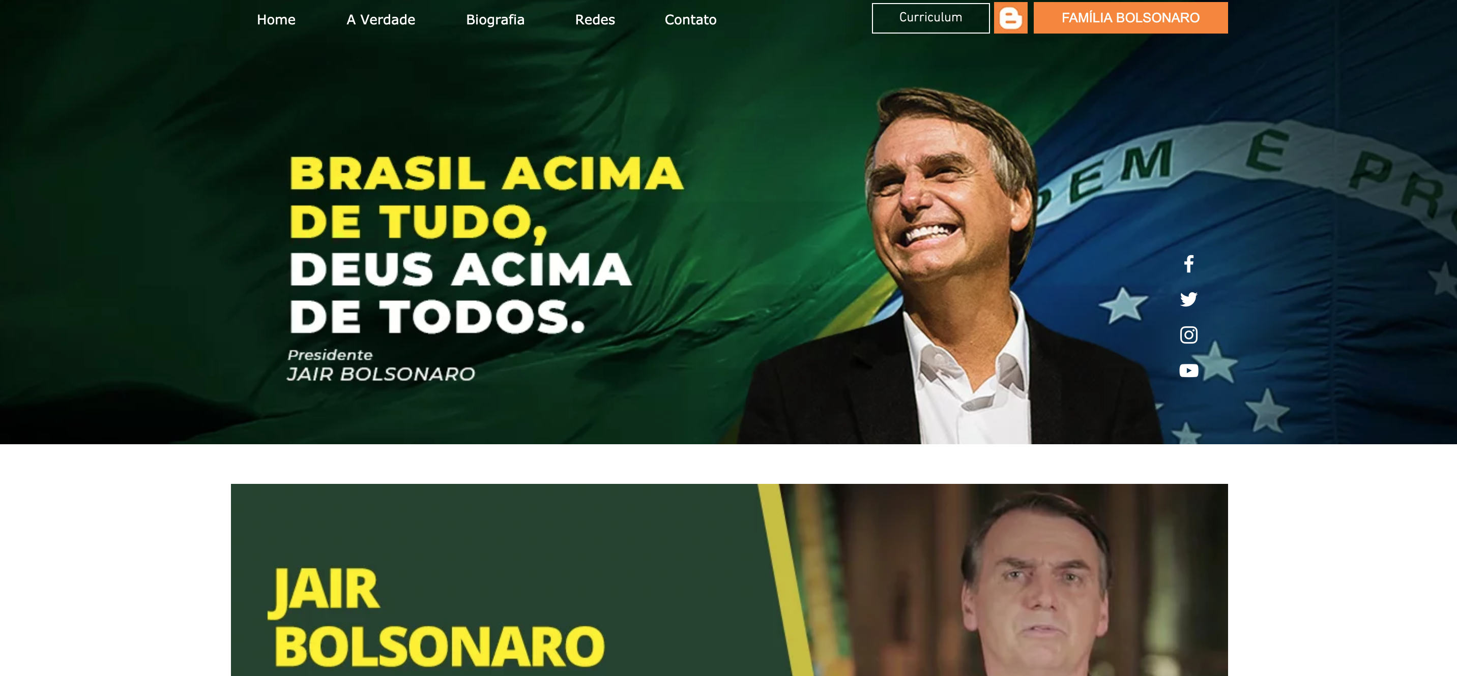
With the rise of nationalism in recent years, there are many examples of campaigns with “nationalistic“ design language, with strict use of the national colors and glorification of the party leader as the sole protectors of the state. Brazil’s new president, Jair Bolsonaro, noticeably used the yellow and green of the Brazilian flag as the main hues of his campaign. His opponent, Fernando Haddad, used a broader color scheme, adding in shades of blue along with the traditional yellow and green. In the end, Bolsonaro’s nationalistic language, which his chosen campaign colors underlined, triumphed over the more liberal Haddad.
A Win-Win
But not all is lost. Like everything in life, to every action there’s a counter action. We can look at some of the Democratic campaigns that are popping up, and see some hopeful yellows, refreshing mint greens, bright pinks, and more. And it’s not just the colors. Progressive parties around the world are using design language to communicate their views of acceptance and equality in a new and exciting way.
Design is a thread that runs through all human political movements, but these days it’s looking more and more like a tapestry. Today’s audiences are much more sensitive and savvy: the generation of voters raised in the internet era is propelling us into a newly “visual age.“ Voters are pushing the political world to produce better visuals, and by doing so, the conversations around it can be elevated. It’s a win-win, and that hardly ever happens in politics.