Case Study
Ottobock Repositioning

Creating a brand with compassion at its heart
Ottobock is a global market leader in orthopaedic technology, helping people to remain mobile in later life. As a traditional company with strong brand values, Ottobock is defined by how these values are conveyed to customers and employees, today more than ever.
Involving patients, doctors, technicians and therapists calls for a trustworthy brand and transparent communication. The company didn’t just want a new look—they wanted a rethink. We involved both Ottobock’s staff and target customers in the redesign process, making the brand rollout a change process for the whole organization.
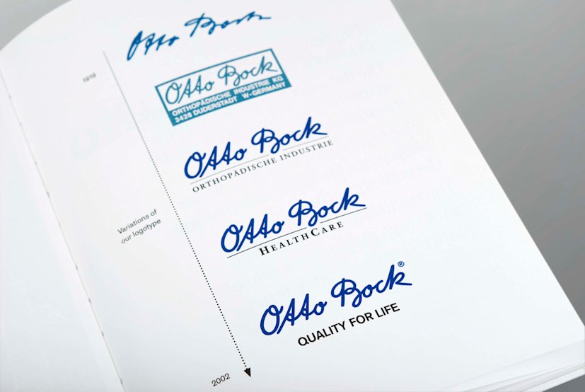
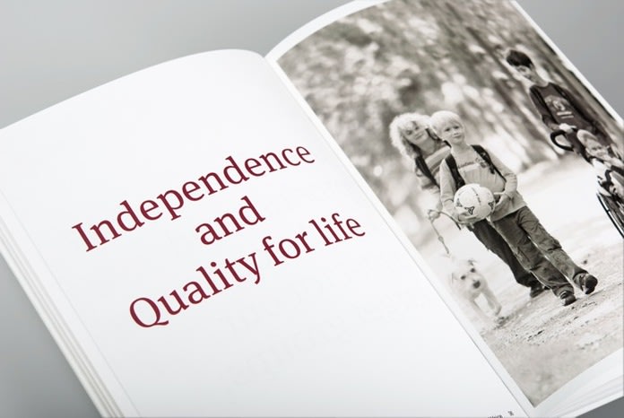

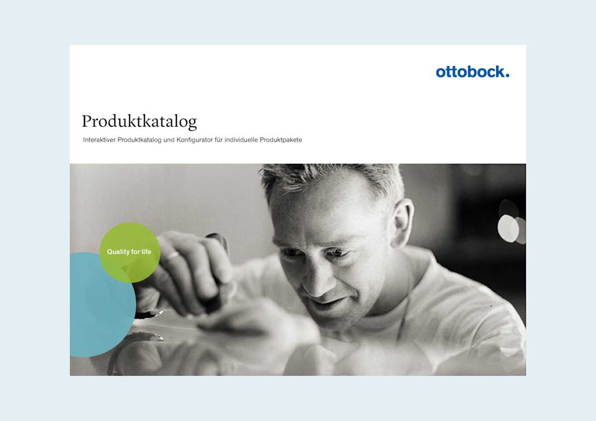
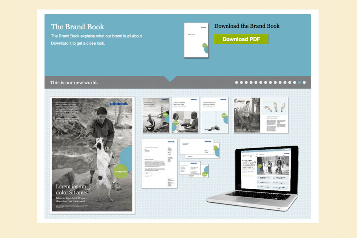
We redefined all brand elements for Ottobock and supported its rollout. The result is a new visual identity and brand positioning, with a clear design that highlights communication. The brand platform enables colleagues worldwide to apply the new brand approach consistently across all media.
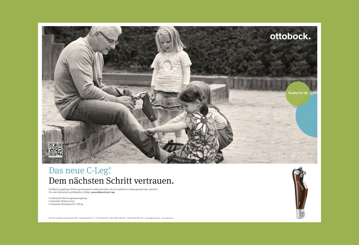
A modern logotype, consistent typography, color scheme and design language all facilitate brand recognition, while authentic imagery with a focus on real people emphasizes the company values: independence and quality for life.
We try to see the world through the eyes of our users and customers: with respect, courage and commitment.Professor Hans Georg Näder, Chairman and CEO of Ottobock
